 |
|
 Jun 24, 2006, 03:36 PM // 15:36
|
#1 |
|
Frost Gate Guardian
Join Date: Jun 2005
|
Ok, I've received pm's asking me to put my "enhanced" screenshots under one thread and discuss the process of turning an ordinary screen capture into something artsy. I could also offer to work on some of your own screenshots and post the result here, as a "before-after" and the mechanics of what came in between.
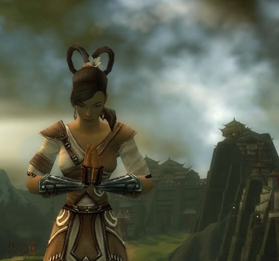
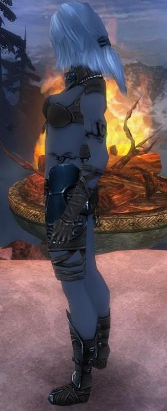
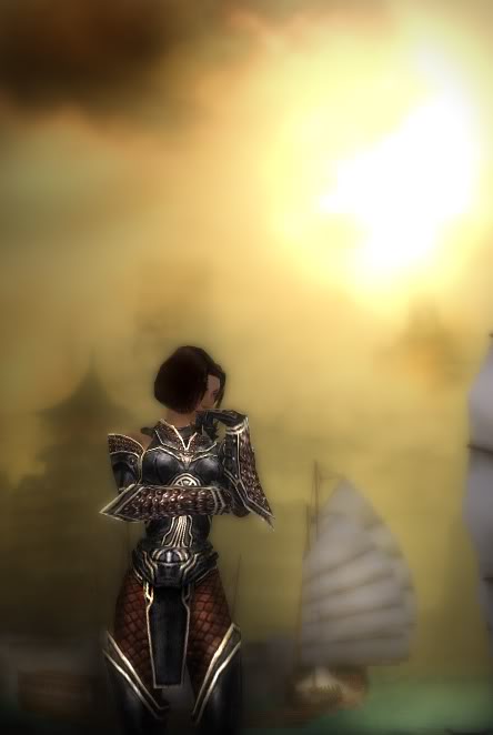
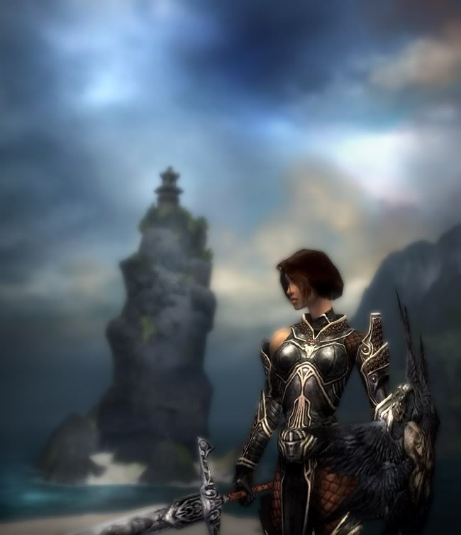
Baby steps into taking a good screenshot: 1) Take one of your favorite characters and go to a place where the surroundings will complement him/her. Avoid as much as possible large, blocky objects such as large-textured walls and stuff like that. 2) Light it up. Every map in GW has a unique light source that comes from one direction. Make your character turn around and notice how light changes as it refracts on him/her. Your character should face the light at no angle larger than 45 degrees. 3) Strike a pose. Like I mentioned in a previous screenshot post, your character is never-tiring, never-complaining and always-willing model (wouldn't fashion photographers love GW models  ). Try emotes and such and repeat them if necessary while observing the gestures. somewhere along the line you'll find something worthy of capturing. ). Try emotes and such and repeat them if necessary while observing the gestures. somewhere along the line you'll find something worthy of capturing. 4) Capture, capture and capture again. Just make sure that your screenshots are taken without the interface, in my case SHIFT-F12. 5) Give your shot a makeover with your favorite image editing program. As always, keep your originals safe and experiment away. So here are my selected works and some behind-the-scenes tidbit. In some I've decided to put the before and after. Saiko, fire elementalist. I decided to spice this screenshot with reddish colors in order to enhance the theme of fire. The location is on the south-east of Shing Jea and the emote used is bowhead. Original image: Enhanced image: Bethany, necromancer. I was looking for a calm and moody place. Found the location near Fort Aspenwood. There's no emote here that I can remember using. (Original accidently deleted. Save your files!) Isako, warrior. I wanted to capture something reminescent of classic, post-renaissance european paintings along with a touch of greek-roman poses that have been used on so many statues. Luckily, the flex emote and the area just outside Shing Jea monastery allowed me to do just that. This is perhaps the shot from which I received the most comments in thread and PM. Original image: Enhanced image: Saeko, monk. She's my newborn and started playing her just a few days ago. The setting here is, again, the outside of Shing Jea monastery and the emote is bow. Original image:  Enhanced image: Isako again. I wanted to capture the essence of the warrior heading with dedication into a dangerous battle. I wanted to give the same feel as when Maximus heads into the Roman Coliseum for the first time in "Gladiator". I found the perfect place for this shot in the last mission where teams have to defeat Shiro. Of course, I had to go alone and the only problem was Mhenlo who kept getting into the picture. To lose him and give me some leverage I used sprint and took screenshots after screenshots while working the angles. Of course, the Kurzick armor has the small drawback of putting front and center a part of Isako's anatomy that somehow's distracts a bit. But I think the overall effect more than compensate. No emotes here, I had Isako walking backward while I was taking the screenshots.  Isako, once more. This time around I wanted to capture a pensive moment. This shot could relate many things but what came to my mind was what could Isako feel after defeating Shiro. There, near a harbor, she could watch the Canthan people reprising their daily lives in a peaceful setting. I rather like the emotion that transpires from this image. The location is the northern part of Raisu's Palace and the emote used is ponder.  Isn't Isako great? Some might think that she's wondering how she went from butt-kicking warrior to supermodel. Well, for this shot I wanted to achieve the "traveler's" look. If the background sets a calm, the shield and sword held by Isako makes the viewer feel that there's some danger lurking about (maybe a butt-pinching crab?). I found this little place north of Minister's Cho estate along the beach. There's no emote for this image.  Noa, ranger. In this shot I wanted the viewer to hear the distant rumbling of the approaching thunder, the bristling of the leaves, to smell the humidity in the air and to feel the first droplets of rain. So, feel absolutely free to comment and ask questions. Bethany |

|
 Jun 24, 2006, 03:48 PM // 15:48
|
#2 |
|
Krytan Explorer
Join Date: Jan 2006
Location: I live in Konglevegen
Profession: N/
|
nice nice, you seems to work a bit with your screenshots, what you use, photoshop, and it looks like you blur the background and make the character stick more out, nicely done
|

|
 Jun 24, 2006, 03:53 PM // 15:53
|
#3 |
|
Lion's Arch Merchant
Join Date: Apr 2006
Location: Sitting on a throne in the mansion of torment.
Profession: D/Mo
|
I loved what you did with Saeko... makes the image seem more like a far off memory of the sadness enveloping Cantha at that time...
What you did with Noa does exactly what you said it would. It brought me there. It let me be where she was... I'm not crazy about any of Isako's, although I do like the enhacement of Bethany at Shing Jea. |

|
 Jun 24, 2006, 04:02 PM // 16:02
|
#4 |
|
Wilds Pathfinder
Join Date: Aug 2005
Guild: SMS
Profession: E/Me
|
Ooh! Ooh! I wanna try!
(I'll put some up later) |

|
 Jun 24, 2006, 04:02 PM // 16:02
|
#5 |
|
Krytan Explorer
Join Date: Apr 2005
Guild: [Dark]
Profession: W/
|
image->apply image, filter->blur->gaussian blur
layer->overlay. simple but cool effect |

|
 Jun 24, 2006, 04:59 PM // 16:59
|
#6 | |
|
Frost Gate Guardian
Join Date: Jun 2005
|
Quote:

|
|

|
 Jun 24, 2006, 05:15 PM // 17:15
|
#7 |
|
Frost Gate Guardian
Join Date: Jun 2006
|
just wondering, how do you get the character on a different layer than the background so that your character doesnt get blurred into the background?
|

|
 Jun 24, 2006, 05:36 PM // 17:36
|
#8 |
|
Frost Gate Guardian
Join Date: Sep 2005
Guild: Clan Union [Uni]
Profession: W/
|
Just cut him out and re-paste :P
|

|
 Jun 24, 2006, 05:42 PM // 17:42
|
#9 | |
|
Ascalonian Squire
Join Date: Feb 2006
Profession: R/Mo
|
Quote:
|
|

|
 Jun 24, 2006, 05:46 PM // 17:46
|
#10 |
|
Frost Gate Guardian
Join Date: Jun 2006
|
yea thats what i was thinking, its just the cut out she did looks really clean, like you cant even tell its there. what tool do you guys use to cut-out? in the past i've just used the lasso tool to trace around the body and cutting out parts of the background little by little, but that doesnt seem to leave such a nice looking cut out that bethany's work. is it just that im not very good at it or are we using a different tool or somethin?
|

|
 Jun 24, 2006, 05:56 PM // 17:56
|
#11 |
|
Desert Nomad
Join Date: Apr 2006
|
well i cant say what she used, but when i need to do something like that (ie, take an element from background and have it on a new seperate layer), i just duplicate, and use eraser.. if youre a bit scared, use a eraser with a bit softer edges.
ive always used this, i cant even use lasso.. tho i think at least in my hands eraser is way better than lasso  as for the images, personally i like most of the originals better  . very constructive critique, no? . very constructive critique, no? 
Last edited by fb2000; Jun 24, 2006 at 06:01 PM // 18:01.. |

|
 Jun 24, 2006, 06:00 PM // 18:00
|
#12 | |
|
Frost Gate Guardian
Join Date: Sep 2005
Guild: Clan Union [Uni]
Profession: W/
|
Quote:
|
|

|
 Jun 24, 2006, 06:29 PM // 18:29
|
#13 | |||
|
Frost Gate Guardian
Join Date: Jun 2005
|
Quote:
Quote:
 Quote:
|
|||

|
 Jun 24, 2006, 06:44 PM // 18:44
|
#14 | |
|
Ascalonian Squire
Join Date: Dec 2005
Profession: W/Mo
|
Quote:
Last edited by menikamatii; Jun 24, 2006 at 06:56 PM // 18:56.. |
|

|
 Jun 24, 2006, 07:55 PM // 19:55
|
#15 |
|
Krytan Explorer
Join Date: Nov 2005
Location: a box
Guild: I hop around
Profession: W/D
|
hey can you do one for me =/
|

|
 Jun 24, 2006, 07:55 PM // 19:55
|
#16 |
|
Krytan Explorer
Join Date: Nov 2005
Location: a box
Guild: I hop around
Profession: W/D
|
oh btw what program do you use? Photoshop?
|

|
 Jun 24, 2006, 07:56 PM // 19:56
|
#17 |
|
Wilds Pathfinder
Join Date: Aug 2005
Location: London, UK
Guild: Powerpuff Boys [PUFF]
Profession: R/
|
I'm too jealous, I think I'm going to make a plan to uninstall Photoshop from your PC
 Keep making more stuff and tell us how you cut out/blurred etc! :O lovin it |

|
 Jun 24, 2006, 08:17 PM // 20:17
|
#18 | ||||
|
Frost Gate Guardian
Join Date: Jun 2005
|
Quote:
Quote:
Quote:
Quote:
|
||||

|
 Jun 24, 2006, 08:20 PM // 20:20
|
#19 |
|
Jungle Guide
Join Date: Aug 2005
Location: Germany
Guild: Phantom Commando
Profession: N/
|
I think you copy the layer, put a layer mask on it and then use a soft edge brush to make your character come out.
I have to say that your work is good. Though it's something that someone with a bit knowledge of Photoshop can do. |

|
 Jun 24, 2006, 09:00 PM // 21:00
|
#20 | |
|
Frost Gate Guardian
Join Date: Jun 2005
|
Quote:

|
|

|
 |
|
«
Previous Thread
|
Next Thread
»
| Thread Tools | |
| Display Modes | |
|
|
All times are GMT. The time now is 03:14 PM // 15:14.


 Linear Mode


