 |
|
|
|||||||
| View Poll Results: Who should win. | |||
| Arala Starsong |
|
31 | 39.74% |
| Szei Ren |
|
34 | 43.59% |
| The person that should've won was eliminated! |
|
13 | 16.67% |
| Voters: 78. This poll is closed | |||
 |
|
|
Thread Tools | Display Modes |
 May 04, 2007, 05:23 AM // 05:23
|
#181 |
|
Academy Page
Join Date: Feb 2006
Guild: Caleb Kane Fanclub [CK]
Profession: A/
|
Beyoncee's pictures have been sent.
I really have no idea how they'll be recieved. I wish I could of done better - but I had no ideas! I'm nervous. Here's an outtake. This is what happens when everyone wants to be a model  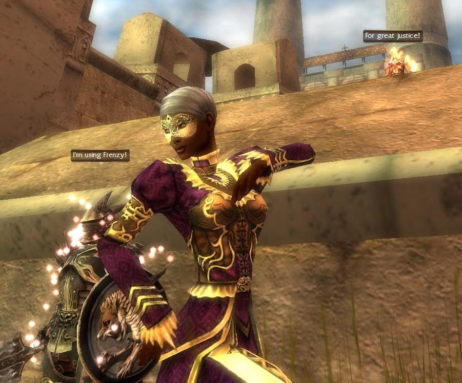
|

|
 May 04, 2007, 07:13 AM // 07:13
|
#182 |
|
Krytan Explorer
Join Date: Nov 2006
Profession: D/
|
i really messed up this shoot =[ im not particularly happy with what i sent in, i could have done alot more given the time but whats done is done.
PS! Great shots! Everyone has hot male characters, makes me want a hot male character! O.o |

|
 May 04, 2007, 02:19 PM // 14:19
|
#183 |
|
Krytan Explorer
Join Date: Jul 2005
Location: Crystal Lake, Illinois
Guild: Grenths Rejects [GR]
|
I had a lot of fun with this shoot, but it was a hectic week for me and I only got one day to shoot. Thank goodness I got the picture I wanted!!
Here are a couple of the pictures that I cut from submission: 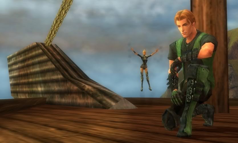 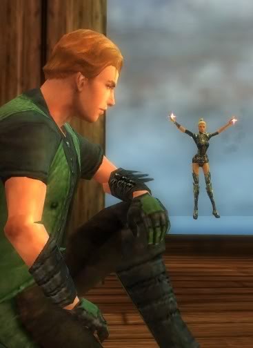
|

|
 May 04, 2007, 03:16 PM // 15:16
|
#184 |
|
Krytan Explorer
Join Date: Nov 2006
Profession: D/
|
I'll post a few of my discarded shots too then! (i think im being a bit of a drip..)
To me this pic says: "Its because I love you that you must die." 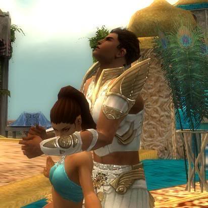 And this one I was gutted i didnt get a good camera angle for it, could have been really romantic! 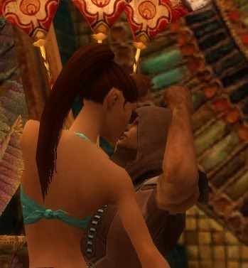
|

|
 May 05, 2007, 04:22 PM // 16:22
|
#185 |
|
Krytan Explorer
Join Date: May 2006
Guild: Silver Millenium
Profession: E/Me
|
Arala Starsong
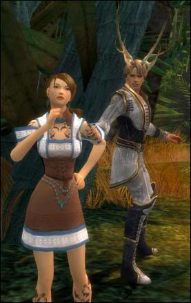 "During the first chapter, straight after Alice falls down the hole, she stumbles across the rabbit, who immediately glances at his watch and runs away." Judge 1: I think you captured that mood that you we're trying to achieve. It looks like Alice is looking around confused and the "rabbit" looks startled. It's a nice picture. Judge 2: I think you should lose the tattoos next time, at least on the feet. Model's don't sport tattoos that are too visible. Other than that, the male model is properly shown, I feel that connection that is there between the two characters. Judge 3: I like the curious vibe that I get from Alice, Alice was a very curious girl, so that works for me. Beyoncee Knowlez 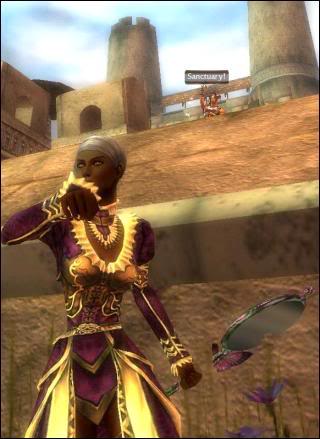 "Esmerelda is to be hanged for the attempted murder of Phoebus. Quasimodo saves her, and brings her back to the cathedral. In the movie, he swings down in from the tower, and saves her. In the photo, I put Quasimodo in the tower, before he saves her while Esmerelda looks at the crowd waiting to take her life." Judge 1: Your face is hidden, you're holding a focus item which is kinda glitchy, your male model is unnoticable. The picture is a sloppy mess. Judge 2: I think if you move the angle and got some more of your face and lose the mirror, it would've been a better shot. Judge 3: I think you we're thinking too much about the details and totally forgot that you we're modeling. You captured the scene well, but you lost the modeling aspect of the assignment. Bierflesjes Klauw 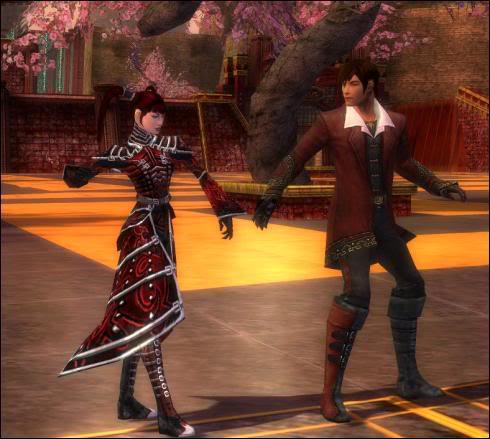 "I looked Mulan up and found out that her name translated into Chinese meant flower of the lily magnolia and that she had these in her garden, so I knew that the best place would most likely be Imperial Isle because of the trees there looked just like them." Judge 1: Your picture definitely captures the asian aspect from Mulan. The scene and the red colors work together. I like the sweet pose of holding hands and walking through the scenery that you managed to achieve with your male model. Judge 2: Picture is pretty, but what's the story behind the picture? I think you failed as far as trying to portray Mulan, you captured Cantha, I got the asian theme, but not Mulan. Judge 3: I think this could be Mulan, not anything significant in the story, but I could see this happening. It's a nice picture, I just don't like your right arm in that position, its very strange. Geisha Nugra 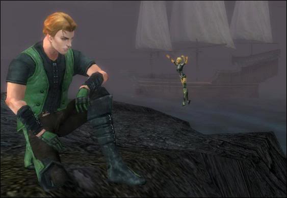 "The scene I tried to re-create was a variation between the movie "Hook" and the original "Peter Pan". In the scene, Tink (Tinkerbell) is trying to encourage Peter to go and fight Capitan (James) Hook and Hook's band of adult pirates with Peter's army of lost boys on Hook's ship." Judge 1: Can't see face, can't see much of you, your male model completely overshadows you, literally. Judge 2: Again, you obviously don't stand out in the picture. If anything, I would've placed the male model in the back and made it look like you we're up close and trying to fly back to him. Judge 3: You went too far as far as detailing your character and completely forgot that you're modeling. This is a very creative shot, but this is by no means a good shot for fashion. Lokii Dia 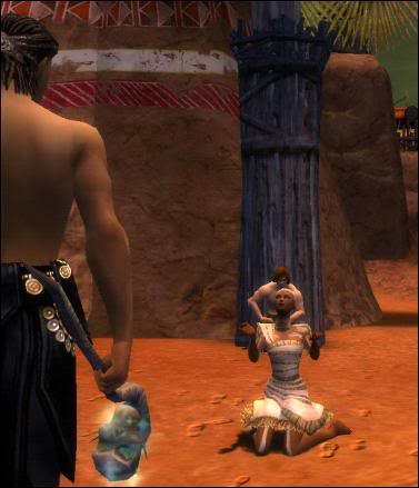 "From the Disney version of Pocahontas, I tried to recreate the scene where Pocahontas saves John Smith from beheading(or clubbing) from her father. The message is strong and I couldn't get my mind away from that certain scene." Judge 1: You're a little underwhelming in this shot, but so are the two male models you manage to put in. No one is dominant in this picture, no one has presence in the shot. Judge 2: I totally get this scene, but the execution of the shot is very bad. There's no presence in this shot at all, no one is really featured, the connection between models aren't there, and this is the shoot where you need to work with that male model. Judge 3: You definitely nailed the scene right down to the details, but where's the modeling? Great job getting the details down in that scene, but when its all said and done, if its not a model shot, its not good. Lunamaria Cruz 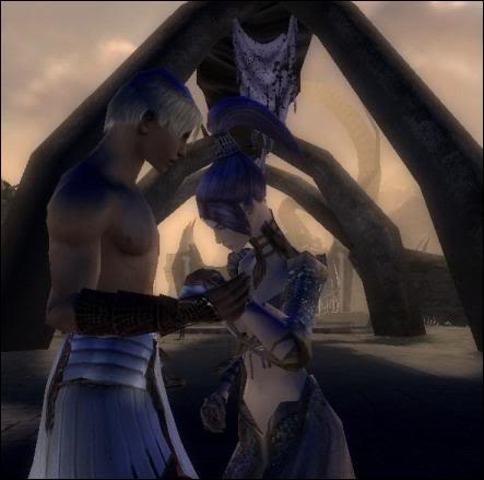 "The scene i tried to recreate in my own manner is the one where Zeus and Hera devasted and comforting rach other after having to abbandon and send theyre baby to the mortal realm in order to save him." Judge 1: Your face is slightly hidden and the lighting is dark, but the shot itself overall is not bad. Judge 2: It is dark, however, that is what the scene is all about, you managed to capture the emotion in the scene and it all works together well. Judge 3: I like the shot, it looks very sad, it really does capture that emotion that they had in the movie. However, I would've really pull it back just a tad bit more and be more aware about the modeling aspect. Mila Fox 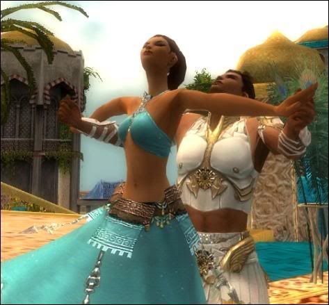 "I tried to recreate the scene where Jasmine has fallen for Ali, know knowing that he was the one who had been in the marketplace when she took her trip away, yet, she is blissfully unaware of his own heritage." Judge 1: Firstly, you need to be confident in what you turn in, if you keep thinking negatively about your shot, I'm going to do the same. Fake it till you make it. Now about your shot, it is lovely! You are the star of your shot. Judge 2: I'm not sure if i get the scene you wanted to portray, however, you did manage to capture the "A Whole New World" scene for me. It really does look like he's holding her arms out while they we're flying on the carpet. Very beautifully done. Judge 3: I agree with both judges, you really need to be confident in what you turn in. In real life, designers and photographers are going to give you things to wear that are so awful and strange looking, but you have to wear it like its the best thing ever and just work it. So when you talk down about your work, its basically a chance for us to say, "Oh really? You don't do well in this? next person please". Granted you're not the only one, so everyone needs to learn from this. For your picture, its absolutely gorgeous, like judge 2 mentioned, this really does look like the scene from "A Whole New World". On top of that, you did the shot in the daytime instead in the night time in the movie, which really worked for you whether or not you realize that. Although it wouldn't been better if you managed to find that night time look with that glimmer of light to fully capture that heavenly, romantic moment. Miss Melly 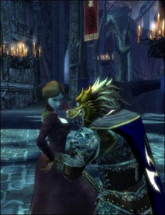 "As the Beast gracefully lifts her up, Belle gazes into his eyes for the first time and realizes despite his horrendous appearance, a warm heart is present within. With this photo I wanted to capture the first moment of a budding romance between the Beauty and the Beast." Judge 1: I love the mask on the male model, it really does make him look like the beast! That was a good call on your part. Judge 2: This is a very good job! Very nicely done, both of your characters are actively engaged with one another. Judge 3: You almost had me as far as details, I truly think if you dyed your dress yellow and had the male model dye his dragon mask brown, you would've nailed the shoot hands down. Mojave Mango Juice 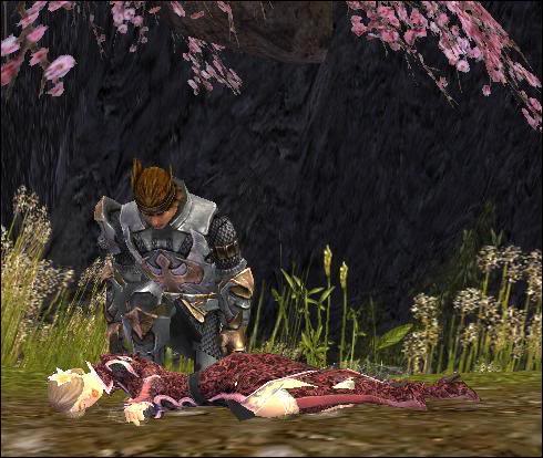 "In this scene, Prince Philip has just slain the dragon Maleficient and is about to give Princess Aurora the kiss that will release her from her "coma." I chose this location because (as it is difficult to come across big castles with explorable sleeping quarters in GW ) it seems fitting for a sleeping princess." Judge 1: Drop dead gorgeous! You're dead but you are the main focus of the shot. The pose is very boring, but it gets the point through. Judge 2: It's very romantic, you are the damsel in distress and he's definitely the knight in shining armor. The picture is very cleverly executed. Judge 3: It's a very pretty shot, but your poses are very safe, first, it was sit, and now its dead, you really need to take a step up. There are plenty of ways to be sleepy and not be dead. Sarah Eleanore 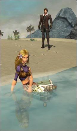 "Eric finds her at the shore and then takes her to the castle. This is somewhat what I wanted to portray here, although I wanted to keep the illusion of her fishtail in the picture to make it more obvious she's Ariel." Judge 1: That was a very smart choice, I do remember that scene, although she was naked and wearing rags. However, the fact that mention you wanted to keep that illusion of a fish tail really works, the armor piece you have really does look like scales on a mermaid's tail. Judge 2: I think you did have a harder assignment to work on, and you really manage to get a decent shot. I love the illusion of the tail, it really does look like a tail at first glance! Judge 3: The picture does work, however, I just think if you had capture your Eric to run over to you, it would've been better than him just standing there. Szei Ren 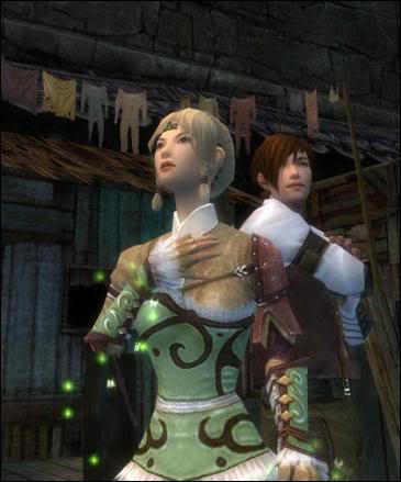 "Anastasia is an orphaned girl with no memory of her family, so she is feeling lost and alone in the harsh real world. Dimitri finds a auspicious candidate for his "big con", and attaches himself to Anastasia, implying to help find her relatives." Judge 1: I do find this to be able to pull off a good movie post. It does have that feeling of Anastasia's dream of finding who she is and dimitri's rags to riches dream. Judge 2: Aura does look bad, it doesn't look like you're trying in the least to hide/compensate for it in this shot, its so blantly present. You probably could've angled yourself to have that same pose with your hand to your chest in a side view and lose that aura. Judge 3: I do like this shot, it really does capture that anxious, wishful girl that Anastasia was. I almost want to caption this picture with "Dare to dream". Alright everyone we have our scores. I really think that a lot of you we're really concentrating too much on the details and totally forgot the fact that this is a "modeling" competition. On top of that, many of you forgot to name your male models, and believe me, that will have weight on our deliberations as well. It is a rule to name anyone you include in your shot, and again, i will not baby you and remind you about it. When you sent in those applications, you basically signed and told me that you understood and read our rules, which clearly, wasn't the case... I wish everyone good luck. |

|
 May 05, 2007, 05:51 PM // 17:51
|
#186 |
|
Ascalonian Squire
Join Date: Jun 2006
Profession: R/
|
Yay results! I'm so glad I didn't get bad comments.
But now I wanna hit my head because I had this picture that was almost the same but with Eric running towards me, I was debating whether to send this in or the one I did sent in: http://img.photobucket.com/albums/v7...ahEcrop871.jpg I thought you could see Oepsie Woepsie (male mesmer model) better in the picture I did sent in though.. but I guess should've done that, but oh well, can't change it anymore. Everyone's done so well though! It really was a hard competition, I realize that now (first you're only anxious of your own picture, but with the results you see how everyone was so creative!), I gotta say I love Arala Starsong's, Lunamaria Cruz', Miss Melly's and Mojave Mango Juice's the best. To be fair, I think Geisha Nugra had one of the hardest characters to portray because she's supposed to be small and it's hard to really dominate that way. Good luck everyone for points and stuff! |

|
 May 05, 2007, 05:56 PM // 17:56
|
#187 |
|
Desert Nomad
Join Date: Jan 2006
Location: Lost in the sands of time...
Guild: Blood Of Orr [BoO]
Profession: R/Rt
|
Lovely shots ladies!!! =)
|

|
 May 05, 2007, 06:03 PM // 18:03
|
#188 |
|
Krytan Explorer
Join Date: Aug 2006
Location: my guildhall.
Profession: Mo/
|
oh my o_o I literally slapped myself just now lol, I was even thinking do I have to include my friends name or not? a few minutes before I sent it in and totally forgot..By the looks of us none of us did REALLY good this week

|

|
 May 05, 2007, 06:11 PM // 18:11
|
#189 |
|
Elite Guru
 Join Date: Feb 2007
Location: Luxembourg
Guild: DVD Forums [DVDF]
Profession: Me/
|
Wahooo ! ^_^ I'm pretty much satisfied with the result
 Now on the next assignment i gotta be more aware of the modelling apsect and ... the typos/ missing words in my explanations lol . Congratz everyone  nice work. Nugra... even though you reduced yourself maybe too much, the idea though ... it is.. just ....fascinating. nice work. Nugra... even though you reduced yourself maybe too much, the idea though ... it is.. just ....fascinating.I really love it. Last edited by Oogami; May 05, 2007 at 06:16 PM // 18:16.. |

|
 May 05, 2007, 06:18 PM // 18:18
|
#190 |
|
Jungle Guide
Join Date: Aug 2006
|
Bleh, I guess I shouldn't have remained so true to the story...its just that there was never really a part when she was with the Prince that she seemed sleepy...it was a magical coma :S
Also, I was a bit confused by the "first, it was sit, and now its dead". I did /beg last week, not /sit. It was a lot of fun working with Lokii on hers (my Dakota was John Smith)  I really like how several of these pictures turned out, Arala's and Geisha's stand out to me the most. Good job and good luck, everyone 
Last edited by mojave mango juice; May 05, 2007 at 09:31 PM // 21:31.. |

|
 May 05, 2007, 06:29 PM // 18:29
|
#191 |
|
Lion's Arch Merchant
Join Date: Jun 2005
Guild: Guardians of the Black Curtain [GBC]
Profession: N/Me
|
Boo to Lokii!! :O (j/k hun I still think you did good)
Lokii's comp died today so she is in a bad mood about that but she wishes the girl's luck  . .I personally liked Miss Melly's. I was wondering what she was gonna do, but I agree with Judge 3 you should of dyed it yellow. It would of been epic win! anyway good luck girls! Last edited by Detis Zan; May 05, 2007 at 06:41 PM // 18:41.. |

|
 May 05, 2007, 07:21 PM // 19:21
|
#192 |
|
Krytan Explorer
Join Date: Nov 2006
Profession: D/
|
oh dear =S i sorta put my foot in that a little bit. I really love Lokii's shot. I saw Pocahontas recently and thats a great scene. I love the angle of the "Chief" as opposed to Mr.Smith(?)
Everyones shots are so fantastic! Looking over them its hard to pick a favourite! I think I'm biased towards my favourite disney characters though ^^ (PS! I'll try not 2b a drip again this week LOL) |

|
 May 05, 2007, 07:30 PM // 19:30
|
#193 |
|
Academy Page
Join Date: Feb 2006
Guild: Caleb Kane Fanclub [CK]
Profession: A/
|
Ouch, I figured the picture wasn't very good - but I had no idea what to do. Does anyone have any suggestions of what I could of done to improve it?
I just hope my scores from last week keep me through... Edit: I think that Geisha Nugra has the best photo, tbh. This was a hard photoshoot - and that's the picture I looked at and said "Wow." Last edited by Caleb Kane; May 05, 2007 at 08:14 PM // 20:14.. |

|
 May 05, 2007, 07:38 PM // 19:38
|
#194 |
|
Lion's Arch Merchant
Join Date: Aug 2005
Location: Finland
Guild: I Need Scissors [Aivo]
Profession: Rt/
|
I must say I love Lunamaria Cruz's picture, it's got such a tender feeling and I admire the way you've both managed to position your characters and emotes so perfectly. Great work, imo.
I also admire the ideas behind all of this round's shots, you've all been really creative  . In that aspect my favourites are Beyoncee Knowlez's, Miss Melly's and Geisha Nugra's shots. . In that aspect my favourites are Beyoncee Knowlez's, Miss Melly's and Geisha Nugra's shots.*anxiously waiting for results* |

|
 May 05, 2007, 08:17 PM // 20:17
|
#195 |
|
Ascalonian Squire
Join Date: Feb 2006
Location: Spokane, WA
Guild: Frogs In The Ghetto Say Moo [DaWg]
Profession: Me/
|
I don't know what the judges are talking about. The diss on Beyonce's picture was a bit overboard. There are several pics that didn't show off the armor nearly as well as the 'theme'. I mean I realize you have a theme for the picture spread, but all in all if this is about modeling, then you need to remain consistent.
I thought Beyonce's picture was well done. It gave the general mood of Esmarelda, while still focusing on the fashion aspect. I think the judges made a mistake on this one. |

|
 May 05, 2007, 09:22 PM // 21:22
|
#196 |
|
Lion's Arch Merchant
Join Date: Jan 2007
Location: Belgium, Europe
Guild: Grenth's Rejects [GR]
Profession: N/Me
|
Something's seriously wrong with my automated email notifications o_O
I love what you all have done! Fairy tale princesses all around! Good luck! Geisha, your shot is my absolute favourite! |

|
 May 05, 2007, 10:06 PM // 22:06
|
#197 |
|
Wilds Pathfinder
Join Date: Mar 2007
Location: Finland
Profession: R/
|
Nice work there everyone. I'm obliged to comment because I totally love the mood in Lunamaria's shots. Those are really really good. I love the way your eles' face looks really stern and forlorn from that angle and it completelly makes the mood + the blue lightning gives a lot to it. I've always imagined Zeus a big bearded man myself but the para is hot haha. I like yours the best really.
Some of you had some great ideas in there. Geisha's idea is pretty cool although she became so very small but I like it storywise. I love Mango's idea aswell, it's very inventive and the compostion works. The sakura above gives it an especially sleepy mood too and the wammo rules haha. I wasn't that inspired by this assignment because 'Playing Disney Princesses' kind of kills the whole originality and mood for me...to be very honest it's a bit repulsive, it's everywhere. On the other hand many of these pictures have turned out to be much more than just 'model' pictures and I really enjoyed that. I love stories, I love fairytales and pictures that have a story to them. Good work everyone! |

|
 May 05, 2007, 10:33 PM // 22:33
|
#198 |
|
Ascalonian Squire
Join Date: Dec 2006
Location: My guild hall, where I scavenge for mice and berries
Guild: Grenths Rejects [GR] (leader)
Profession: Mo/
|
Who's that awesome wammo in the pic with mango?? Oh hey! That's me! xD
I'd like to say great pics all and gl, and ty for the comment on me warrior nian 
|

|
 May 05, 2007, 10:52 PM // 22:52
|
#199 |
|
Bad Romance
Join Date: May 2006
Location: Aussie Trolling Crew HQ - Grand Matron
Profession: Mo/
|
Wow, I think there's something I love in everyone's pictures. Geisha, that's just too cute, and Lunamaria, it's such a tender shot.
 Mila's is just beautiful.. and Mango's.. and every other shot too! Mila's is just beautiful.. and Mango's.. and every other shot too! I remembered the male model's name about half an hour after I sent my, and sent it separately, so hopefully that counted. Good luck everyone! 
|

|
 May 05, 2007, 10:54 PM // 22:54
|
#200 |
|
Bad Romance
Join Date: May 2006
Location: Aussie Trolling Crew HQ - Grand Matron
Profession: Mo/
|
gah, double post -_-
|

|
 |
|
«
Previous Thread
|
Next Thread
»
| Thread Tools | |
| Display Modes | |
|
|
All times are GMT. The time now is 03:11 PM // 15:11.


 Linear Mode


