 |
|


 Nov 19, 2005, 08:46 PM // 20:46
|
#201 |
|
Academy Page
Join Date: Sep 2005
Location: A fairyland with roots in history
Profession: Me/N
|

Ive moved the conditions bar so teh icons start over the menu bar so i can easily see whats on me when i look at the cooldown
|

|

|
|
Nov 20, 2005, 03:10 PM // 15:10
|
#202 |
|
Academy Page
Join Date: Jul 2005
Guild: Guardians Of Flame [GoF]
Profession: N/Mo
|
here is my, all things at the bottom:
|
|
|
|
|
Nov 21, 2005, 06:13 AM // 06:13
|
#203 |
|
Pre-Searing Cadet
Join Date: Nov 2005
Profession: Mo/Me
|
Thanks for tip
|
|
|
|
|
Nov 21, 2005, 09:56 AM // 09:56
|
#204 |
|
Desert Nomad
Join Date: Aug 2005
Location: Behind you with a knife
Guild: Celebrity Gangsters [FamE]
Profession: Me/
|
I don't even use the mouse, I just have my left hand on the movements and my right hand on the skills. Tab for enemies and Shift+Tab to back track to the last enemy. Usually when I'm starting out and not using skills yet, I'll use the mouse to target my enemy and do starting skills. Depends on my mood.
|
|
|
|
|
Nov 21, 2005, 05:28 PM // 17:28
|
#205 |
|
Ascalonian Squire
Join Date: Jun 2005
|
May as well post up a shot of mine...
|
|
|
|
|
Nov 23, 2005, 12:54 AM // 00:54
|
#206 |
|
Ascalonian Squire
Join Date: Jul 2005
Guild: The Shattered Hand [TSH]
|
 Please, please dont focus on my skillset (I made it for testing out the interface anyway...) and instead talk about my interface (it is my level 15 monk that I am making for now, she doesnt have to be perfect). I like it because it just makes my life easier mostly. It is a lot easier to pay attention to my health/energy when they are displayed so largely on my screen (vertical bars help a lot too). Since I use numbers for my skills, I lowered the size of my skill bar and placed it in the corner, as a reference. The compass is useful, but not so much that it should take up half of your screen so I sized it down a bit. Your FPS is always nice to know and I put that there too. I play interrupter a lot and knowing what skills are being cast in BIIIG letters with a long bar helps a lot. I am also interested in my cast times so the bar above the bar that displays what the target is casting (which, at the time, was myself) always shows me how much longer I have to wait to cast another spell. Also, I get a nice panoramic view too.  Really, mine is made for my own personal needs but is a good interface in general IMO. Much better than the default at least. |
|
|
|
|
Nov 24, 2005, 09:59 AM // 09:59
|
#207 |
|
Frost Gate Guardian
Join Date: Apr 2005
Location: StL
Guild: [FahQ] Fierce Alliance HeadQuarters
Profession: R/W
|
here is my desktop
how i have my hud edited, and how i view vent with gw 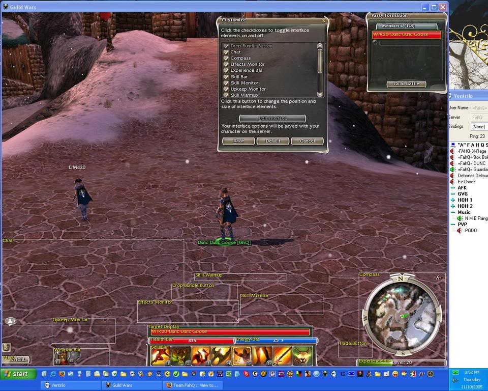
|
|
|
|
|
Nov 25, 2005, 04:45 PM // 16:45
|
#208 |
|
Forge Runner
Join Date: Sep 2005
Location: Uk,Wales
|
here is mine abck in the glory farming with my old monk
(i deleted him by accident)  wohooo.JPG ")
Last edited by dont feel no pain; Nov 25, 2005 at 04:48 PM // 16:48.. |
|
|
|
|
Nov 27, 2005, 10:09 PM // 22:09
|
#209 |
|
Krytan Explorer
Join Date: May 2005
Location: norfolk
Guild: Super Anti Rabbit Squad [SARS]
Profession: Mo/Me
|
This is the normal version default setup:http://img167.imageshack.us/img167/7933/gw0343kx.jpg
But this is what i want it to be like so that the enchanments that i have cast are next to the person that has recieved it so i can tell who's lost the enchatment without reading through the names by holding my mouse over the picture. Is this possible?: http://img167.imageshack.us/img167/5...034edit2wp.jpg Last edited by chippxero; Nov 27, 2005 at 10:13 PM // 22:13.. |
|
|
|
|
Nov 28, 2005, 08:04 AM // 08:04
|
#210 |
|
Frost Gate Guardian
Join Date: Jul 2005
Guild: That Other Guild [Tog]
|
 Keeps the focus on the center of the screen. |
|
|
|
|
Dec 02, 2005, 11:20 AM // 11:20
|
#211 |
|
Black Beast of Aarrrrgghh
Join Date: May 2005
Location: The Netherlands
Guild: The Biggyverse [PLEB] // Servants of Fortuna [SoF]
|
Question:
when you hover over a skill, it gives a pop up with skilldescription. Is it possible to turn this off? I'm afraid not, but it can be annoying because it can overlap other parts (statusbar) of my interface which I rather keep at the same place. |
|
|
|
|
Dec 02, 2005, 07:02 PM // 19:02
|
#212 | |
|
Krytan Explorer
Join Date: Jul 2005
Guild: [FDG]-Fudge
Profession: Mo/Me
|
Quote:

|
|
|
|
|
|
Dec 11, 2005, 06:52 AM // 06:52
|
#213 |
|
Desert Nomad
Join Date: Aug 2005
Location: California, USA
Guild: Angel Sharks [AS] (RiP [KaiZ] T__T")
Profession: Mo/E
|
Ok. Maybe yall can help me out. My dilemna is simple. I like to see as much as the environment as possible (have the least amount of windows blocking the playing field), yet at the same time i like to easily/readily see my skills, stats, enemy stats and skills, party, map and all the essentials...
I have been changing my HuD setup nearly every week, but still cant get a comfortable setup. Has anyone found a good balance? So far, the screenies posted here seem to focus on function only, rather than the balance of function and visability (aka "form and function"). If anyone else has been seeking this "balance" and has found their happy medium, then PLEASE post a screeny, i just cant find it! BTW, i am a 75% PvE and 25% PvP player, if that helps at all... THANKSSSsssss |
|
|
|
|
Dec 18, 2005, 12:47 PM // 12:47
|
#214 |
|
Frost Gate Guardian
Join Date: Nov 2005
Profession: Mo/Me
|
Some interesting ideas but few I could get confortable with.
This is my current setup, it helps me to keep an eye on enchantments and hexes (which is good for PvP), and frees up a little bit of the top of the screen. I've gotten used to enchantments appearing from right to left suprisingly fast. - To make space for enchantments, upkeep are kept in the same place, but with two rows, so the box is higher, and less wide (in case you're running more then 4 enchantments you'd see 2 rows of 4) - Next to upkeep is enchantments, appearing from right to left, I think it would show as 2 rows of 5/6 when full. - Radar is always reduced a little in my setup - The experience bar is simply hidden, when I hit level 20. The next improvement would be to take the target bar (enemy health) at the bottom, maybe like in one of Ractoh's videos. PS: I KNOW I DONT HAVE A RES SIG, I ALWAYS TELL MY GROUP WHEN I HAVENT BROUGHT IT, PLEASE STAY ON TOPIC. Last edited by ecirbaf; Dec 18, 2005 at 12:56 PM // 12:56.. |
|
|
|
|
Jan 04, 2006, 05:12 AM // 05:12
|
#215 |
|
Pre-Searing Cadet
Join Date: Jan 2006
Guild: Archon Warriors
Profession: E/R
|
Post a screen of your custom layout
Well since there is a feature to set up your HUD how you wish it to be displayed I figured why not see what others have done.
EDIT: Here is my Layout, im not sure if Im going to keep it tho as it obstructs my view near the top of the screen. Who knows tho. Any ways this is a new character if your wondering why it sucks =p. Last edited by Lightz; Jan 04, 2006 at 06:19 AM // 06:19.. |
|
|
|
|
Jan 04, 2006, 05:16 AM // 05:16
|
#216 |
|
Desert Nomad
Join Date: Dec 2005
Profession: N/Mo
|
That would be me after ALMOST soloing the entire GoK mission. With a bit of effort, I'll do it next time. I quite like my HUD. It works well with the party window, (when there is a party ) for healing and such...Edit : the bloody filter even filters web addresses for christ's sake! Last edited by Apple; Jan 04, 2006 at 05:20 AM // 05:20.. |
|
|
|
|
Jan 04, 2006, 05:38 AM // 05:38
|
#217 |
|
Pre-Searing Cadet
Join Date: Jan 2006
Guild: Archon Warriors
Profession: E/R
|
Ill be posting mine once i get one I really think works for me. Im fairly new to the game, got it about a week or so ago so im not quite up to speed on everything yet. How ever I know quite a bit.
|
|
|
|
|
Jan 04, 2006, 07:08 AM // 07:08
|
#218 |
|
Lion's Arch Merchant
Join Date: Oct 2005
Location: Australia
Guild: Shameful Spirits
|
I stole my HUD from Specious
 . .It keeps my vision in the centre of the screen, so I don't focus on one particular spot, so it reminds me to keep track of enemy warriors and damage. You can't see it, but the effects bar is below the skillbar, and the maintained enchants bar is parallel to the right of the skillbar. So between the party window and the skillbar, above the health bar. |
|
|
|
|
Jan 04, 2006, 07:30 AM // 07:30
|
#219 |
|
Krytan Explorer
Join Date: Dec 2005
Location: United States [KS]
Guild: [none]
Profession: R/W
|
my layout
|
|
|
|
|
Jan 04, 2006, 07:58 AM // 07:58
|
#220 |
|
Pre-Searing Cadet
Join Date: Jan 2006
Guild: Archon Warriors
Profession: E/R
|
Ok i got rid of my origanl HUD because it cause to much problems having to look up all the time. This HUD is nice and small, it also is easy to see and interact with. I posted the version in edit mode incase any one wants to use the layout. I also have it in true resolution this time 1280x1024, instead of the 1024x768 i viewed my last HUD in.
[Normal] [Edit Mode] |
|
|
|
 |
|

«
Previous Thread
|
Next Thread
»
| Thread Tools | |
| Display Modes | |


 Linear Mode

|
|

 Similar Threads
|
||||
| Thread | Thread Starter | Forum | Replies | Last Post |
| Post Your Interface! | greenreaper3 | Screenshot Exposition | 3 | Nov 04, 2008 05:31 PM // 17:31 |
| Post Pictures of armour dyed "UNIQUELY" - Also post your Dye Combo! | Da Cebuano | Screenshot Exposition | 660 | Sep 16, 2008 12:57 AM // 00:57 |
| Kyosuki | Screenshot Exposition | 5 | Jul 24, 2006 08:22 AM // 08:22 | |
| Post Your Interface... | tidu | Screenshot Exposition | 2 | May 28, 2005 10:44 PM // 22:44 |
All times are GMT. The time now is 11:27 AM // 11:27.
