 |
|
 Dec 13, 2010, 08:15 PM // 20:15
|
#681 |
|
Jungle Guide
Join Date: Jul 2009
Guild: The Kurzick Mob [Mob]
Profession: R/
|
Its ok, im not nearly done either. LOL
i havent bothered to look through magazines lately. But my holiday break starts this weekend (early dismissal friday) so I'll have much more time to finish it for the official contest xD To prevent a double post I'm adding this here. @Tommy, so I was looking at your progress yesterday and ment to post this for you. I think I can see what's "up" with your monk. While the work you did on her is actually really good, the proportions of her body were a bit off. 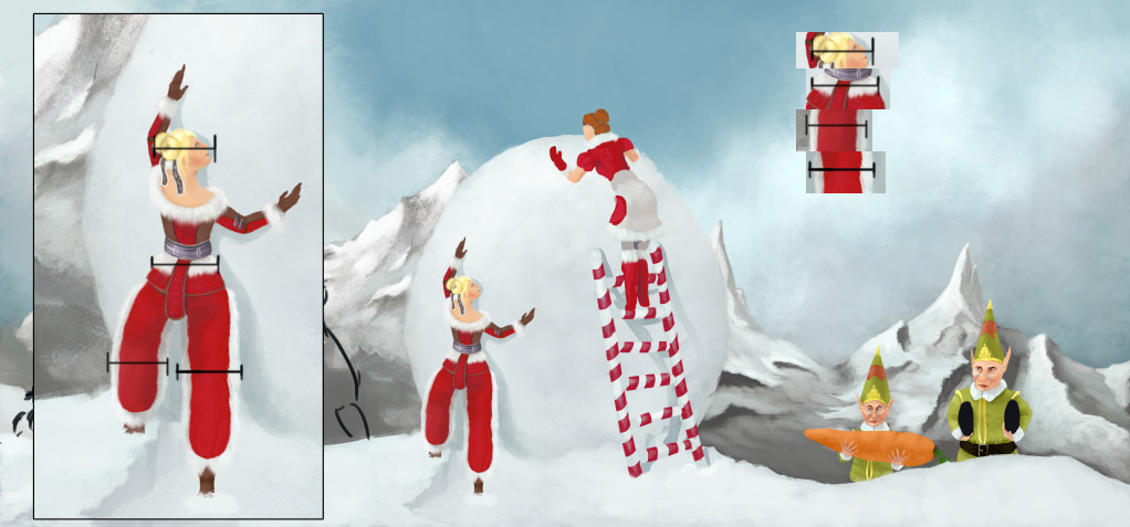 The most important parts of this are the legs and the waist. Both legs are the same width as the hips.. which i don't believe is possible :P Id suggest making her legs thinner, it should look better then. Last edited by Death By An Arrow; Dec 13, 2010 at 10:08 PM // 22:08.. |

|

|
 Dec 13, 2010, 10:33 PM // 22:33
|
#682 |
|
Site Contributor
Join Date: Jul 2008
Location: Dallas, TX. USA
Guild: Not in any guild at the moment
Profession: N/
|
The baked polymer clay jewels again, and the round wooden beads strung up with medallions added. Working on putting the clay jewels on leather strips and attaching them to the wooden bead circle.
I wish I could've found bigger medals for it, but had to make do with the smaller size. |

|

|
 Dec 13, 2010, 11:00 PM // 23:00
|
#683 |
|
Pre-Searing Cadet
Join Date: Dec 2010
Location: Igloo on Jupiter
Guild: The Ishimura
Profession: Rt/
|
@Aeronwen
yes im entering but as for now im on the hunt for a fishbowl and polymer clay!  as for a progress gallery, no. im completely new to forum posting and such so i really dont know how to |

|

|
 Dec 14, 2010, 02:50 AM // 02:50
|
#684 | |
|
Never Too Old
 Join Date: Jul 2006
Location: Rhode Island where there are no GW contests
Guild: Order of First
Profession: W/R
|
Quote:
You also still need a darker area for the back of her knee. When you have your leg bent like that it creates a crease in the cloth that is deeply shadowed even in bright light. Last edited by Darcy; Dec 14, 2010 at 02:52 AM // 02:52.. |
|

|

|
 Dec 14, 2010, 04:45 AM // 04:45
|
#685 |
|
Academy Page
Join Date: Dec 2010
Guild: Fuzzies Anonymous [Fuzy]
Profession: Mo/
|
Woah Tommy you're getting alot of attention...and the stones are darker now! <3 Though they don't look 3D :P i don't think you worked on them yet? Otherwise it's awesome

|

|

|
 Dec 14, 2010, 06:59 AM // 06:59
|
#686 | |
|
Site Contributor
Join Date: Oct 2006
Location: Finland
Guild: Runners of the Rose [RR]
Profession: R/
|
Quote:
I do agree that it needs a much darker crease for the back of the knee, to show that the knee is properly bent. Also, I think the pants need a crease to show where her bottom would be, just so the shape of the body underneath is what gives the shape of the pants as well. Removing the inner trim and perhaps widening the red area of the pants to be closer to each other between the legs might help as well. Example: 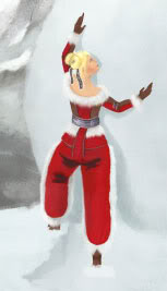 @Magik: Wow, she looks so beautiful! I don't have any comments to add to that, I just keep gawking at the level of detail and prettiness.  Very nice! Very nice!@Spark Addiction: You can make a free progress gallery at photobucket.com, or then register at deviantart.com for another free gallery. Having a progress gallery makes it easier for the judges to find your work for final judging. Instead of saying "No, I don't know how to do that so I won't do it" why not say "No, I don't know how to do that, will you please help me out?"  We are here to help out, the whole point of this Workshop is for people to learn new things and to get comments/critique/praise for their work. EDIT: To avoid double posting... I did some work on my entry last night. Worked on the background and did some small details on her dress. I still need to tweak the snow and some background details, but it's going in the direction I want so that's good.  Last edited by Perynne; Dec 14, 2010 at 07:38 AM // 07:38.. |
|

|

|
 Dec 14, 2010, 08:30 AM // 08:30
|
#687 |
|
Furnace Stoker
Join Date: Dec 2006
Guild: [Bone]
Profession: Mo/
|
Thank you for all the tips and comments.
I'll try to go by them all. First issue is the proportions Death by an Arrow showed me. One thing I think you foget is that her hair is not part of the proportion, neither is the fur on her legs. So her waist is a little bit less wide then 2 legs, and her head is about half the size you posted (since you've also use the diagonal instead of right-angled on her face. So what I'm trying to say is, I think the proportions are fine  Secondly, it seems people have missed my last link, of forgot about it when Death by an arrow quoted an older one. But here it is again: http://img87.imageshack.us/img87/4173/sneakpeak.jpg I already made the creaves a bit darker there, I might need to do it some more, though with so much light I want to restrain using too much contrasts. You are right Pery, except for the part that her left butt needs creaves since its a bit more stretched because its going forward. But I definatly need more shadow on her right butt. And Darcy: ! Lol! I didn't even notice it only had the fur on one side, just assumed it was on both xD Ah well, I must say I like it this way, I guess I'll stick to it. So silly I hadn't noticed. @ Ninja Monk: Yeah I just dropped in colours so I wouldnt forget. Worked some on them now, but you've mist my last link. I posted it again a little bit above in this post :3 |

|

|
 Dec 14, 2010, 09:21 AM // 09:21
|
#688 |
|
Academy Page
Join Date: Dec 2010
Guild: Fuzzies Anonymous [Fuzy]
Profession: Mo/
|
O.o My photoshop doesn't have Other Dynamics setting for brushes (cry softly) What can i do?
 I'm using CS5 I'm using CS5
|

|

|
 Dec 14, 2010, 09:31 AM // 09:31
|
#689 |
|
Furnace Stoker
Join Date: Dec 2006
Guild: [Bone]
Profession: Mo/
|
|

|

|
 Dec 14, 2010, 09:36 AM // 09:36
|
#690 |
|
Site Contributor
Join Date: Oct 2006
Location: Finland
Guild: Runners of the Rose [RR]
Profession: R/
|
Probably this:
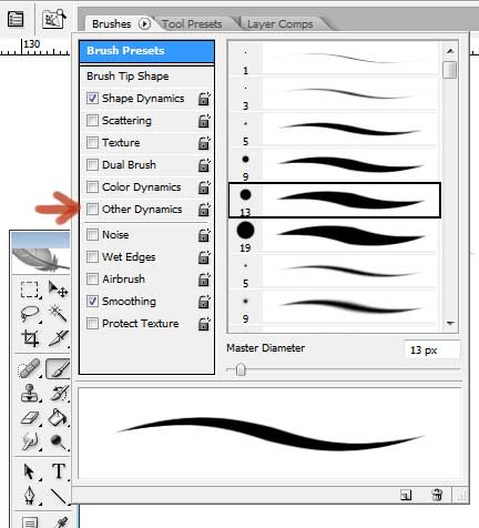 I'm still using CS2 so mine has it. Perhaps the newer versions have done away with it completely, by adding some other settings? I don't know, I haven't used anything above CS3.... Perhaps try finding other ways of tweaking your brush? Or then download other people's custom brushes and just forget about the settings. I don't play around with the settings much either, I tend to be pretty satisfied with what brushes I already have. |

|

|
 Dec 14, 2010, 09:38 AM // 09:38
|
#691 |
|
Furnace Stoker
Join Date: Dec 2006
Guild: [Bone]
Profession: Mo/
|
Ahh that
 Yes its gone in CS5. I can't remember what the function was. What is it used for? CS5 probably moved in somewhere or made it replaceable. Yes its gone in CS5. I can't remember what the function was. What is it used for? CS5 probably moved in somewhere or made it replaceable.
|

|

|
 Dec 14, 2010, 09:41 AM // 09:41
|
#692 |
|
Site Contributor
Join Date: Oct 2006
Location: Finland
Guild: Runners of the Rose [RR]
Profession: R/
|
I tried it out, and yeah, CS5 has probably found a better way to implement it. Basically it controls the opacity and flow depending on pen pressure. Like... you can change it yourself how much pressure you need to apply to get a certain opacity/flow. Seems kind of redundant, since you can do a lot of that with the normal opacity/flow sliders.
|

|

|
 Dec 14, 2010, 09:45 AM // 09:45
|
#693 |
|
Furnace Stoker
Join Date: Dec 2006
Guild: [Bone]
Profession: Mo/
|
Perhabs its replaced by the 2 buttons near the opacity and flow?
Dont know, don't understand the function of it anyway. NEVERMIND! found it :3 http://photo.stackexchange.com/quest...-photoshop-cs5 |

|

|
 Dec 14, 2010, 09:50 AM // 09:50
|
#694 |
|
Academy Page
Join Date: Dec 2010
Guild: Fuzzies Anonymous [Fuzy]
Profession: Mo/
|
Oh wait, i think it's been renamed to Transfer instead o.O
Oh yes they did :P Thanks tommy! |

|

|
 Dec 14, 2010, 09:56 AM // 09:56
|
#695 |
|
Site Contributor
Join Date: Oct 2006
Location: Finland
Guild: Runners of the Rose [RR]
Profession: R/
|
You people with your super-flashy, new Photoshops..... XD Humbug, I say!
*goes back to her granny version* |

|

|
 Dec 14, 2010, 12:39 PM // 12:39
|
#696 |
|
Krytan Explorer
Join Date: Nov 2009
Guild: BhLd
Profession: E/Mo
|
@Perynne: photoshop CS5 is a really good version with a blending tool that's pretty neat both for photograph use and painting :3
|

|

|
 Dec 14, 2010, 01:34 PM // 13:34
|
#697 |
|
Ascalonian Squire
Join Date: Nov 2010
Location: The Mists
Guild: Guild Leader of: More than Seven Deadly Sins [Sins]
Profession: Rt/
|
*Is completely lost within all of the fancy Photoshop talk*
Uhhhhhhhhh???  @Perynne: I don't even have Photoshop at all, so don't feel bad XD All I have are some pencils and paper haha. @Minami: I really love how it's coming along, those beads are nice ^^ I see what you're saying about the bigger medals, but I think that the small ones work just fine as well. @Magik: Dwayna looks absolutely beautiful, but there is just one thing I am noticing about her that doesn't seem right. Her bottom lip looks really crooked to me, like it doesn't align totally 100% with the top lip. Otherwise I think that it looks great =] Also, I feel like a noob for asking this, haha, but how do you guys do that "spoiler" thing with the image in it? I still haven't figured that one out. |

|

|
 Dec 14, 2010, 01:51 PM // 13:51
|
#698 |
|
Site Contributor
Join Date: Jul 2008
Location: Dallas, TX. USA
Guild: Not in any guild at the moment
Profession: N/
|
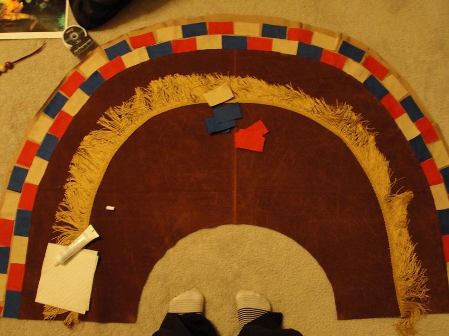
The skirt for the Ritualist.
Fringes are sewn on, and the colored parts fit onto the bottom edge. They're not fixed to the skirt yet. Yes, that's cloth glue  Nemesis, you do the spoil tag by writing "[ spoil] and [ /spoil ]" without the spaces. If you quote a text that has the spoil tag in it, you'll see 
|

|

|
 Dec 14, 2010, 02:19 PM // 14:19
|
#699 |
|
Furnace Stoker
Join Date: Dec 2006
Guild: [Bone]
Profession: Mo/
|
Omai Minami
 when I first saw your pictures, I thought it was rather small, but now I see some feet to compare it with, I now see how big it is. Cool stuff, looks great already. Better be careful now Koreena and Tzu! I smell some rivalry when I first saw your pictures, I thought it was rather small, but now I see some feet to compare it with, I now see how big it is. Cool stuff, looks great already. Better be careful now Koreena and Tzu! I smell some rivalry 
|

|

|
 Dec 14, 2010, 02:39 PM // 14:39
|
#700 |
|
Lion's Arch Merchant
Join Date: Dec 2006
Location: Alabama
Profession: Mo/D
|
@Tommy: I'd go with a little darker, but it is looking better with the slightly darker creases. I really like the environment that you chose! It feels very open/bright/wintry, haha.
@Perynne: Wow, I'm really liking it so far; it's a very cheerful piece! @Minami: I've always hated that Wintersday doesn't exist in Cantha. +1 for the concept, and it's turning out well! |

|

|
 |
|
«
Previous Thread
|
Next Thread
»
| Thread Tools | |
| Display Modes | |
|
|
All times are GMT. The time now is 03:41 AM // 03:41.




 Linear Mode


