 |
|
 Feb 28, 2011, 07:26 PM // 19:26
|
#61 |
|
Jungle Guide
Join Date: Apr 2009
Guild: Eon
Profession: Me/N
|
That looks awesome Verene! Aww they look like they are having fun.
Love the 3d effect on the dice and the paperwork too 
|

|

|
 Feb 28, 2011, 10:36 PM // 22:36
|
#62 |
|
Furnace Stoker
Join Date: Jan 2009
Guild: [SOTA]
Profession: D/
|
Haha, thank you
 Everyone's pretty happy with it, and that means our old badge art (Sesshoumaru from Inuyasha with "Man Woman Moon on Face" written on it...long story) has finally been retired. Everyone's pretty happy with it, and that means our old badge art (Sesshoumaru from Inuyasha with "Man Woman Moon on Face" written on it...long story) has finally been retired.
|

|

|
 Mar 01, 2011, 06:32 AM // 06:32
|
#63 |
|
Site Contributor
Join Date: Aug 2010
|
Silly question, but what's badge art? That pic you did is so cute, but when I think of badge, I think of like those name tags you wear at conferences, so I don't think you mean that? What did the Sesshy one look like? He's one of my fave anime chars! I'm sure you can guess who my kitty, Rin, is named after

|

|

|
 Mar 17, 2011, 05:55 PM // 17:55
|
#64 |
|
Furnace Stoker
Join Date: Jan 2009
Guild: [SOTA]
Profession: D/
|
Wooo, late response XD
That is actually exactly what I mean by badge art! They have our name and department on them; each department has a different color and different artwork. Used to be that everyone could do their own custom art, but the staff has grown so much that they stopped doing that a few years ago. Anyway, something new! I was originally looking for images for a vague idea I had, found the stock photo of the model, and kind of went "OH MY GOD MUST USE THIS". |

|

|
 Mar 18, 2011, 12:17 AM // 00:17
|
#65 |
|
Site Contributor
Join Date: Aug 2010
|
haha, no prob! Today's the first time in a week or two that I've been checking Nolani threads XD, so perfect timing I guess!
That is a very cool pic :O |

|

|
 Mar 24, 2011, 06:45 PM // 18:45
|
#66 |
|
Furnace Stoker
Join Date: Jan 2009
Guild: [SOTA]
Profession: D/
|
So, some photos from my mini-vacation I took a couple of weeks ago - my boyfriend came up to visit, we stayed at my aunt's house on the north side of Chicago, and spent two days in downtown Chicago. We went to Navy Pier, the Art Institute of Chicago, and the Field Museum.
http://www.flickr.com/photos/pointyo...7626341387584/ That's only a small number of the pictures I took - I'm a bit disheartened by the fact that a lot of the ones I took at AI have glass reflections visible in them. Sucks, because I had a bunch that otherwise turned out nice (and since I was shooting in a low-light environment with no flash...yeah). And yes, there's also a picture of us in there 
|

|

|
 Mar 27, 2011, 12:53 AM // 00:53
|
#67 |
|
Furnace Stoker
Join Date: Jan 2009
Guild: [SOTA]
Profession: D/
|
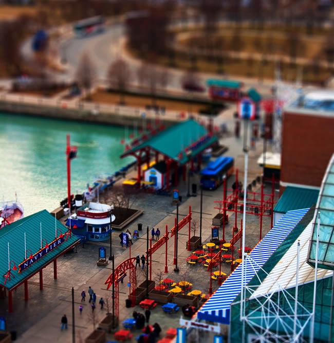
Experimenting with a photography effect known as tilt-shift. I would like an actual tilt-shift lens, but they run for about $1,500-$2,000 from what I can find, so that's not happening. However, it is possible to mimic the effect in Photoshop, assuming that the composition is one that's ideal for it (usually best done with cityscapes taken from high up). The effect makes it look like instead of it being a photo of actual buildings and other objects, it looks like miniatures of those objects.
So this is a photo I took while we were on the ferris wheel at Navy Pier, and then tried out the 'fake' tilt-shift on it in Photoshop. Experiment was a success  
|

|

|
 Mar 27, 2011, 04:43 AM // 04:43
|
#68 |
|
Desert Nomad
Join Date: Jun 2005
Location: USA
Guild: Kirins of Holy Light
Profession: N/
|
Oooh thats a neat effect. I need to find something to try that on.
|

|

|
 Mar 27, 2011, 05:46 PM // 17:46
|
#69 |
|
Desert Nomad
Join Date: Apr 2009
Guild: Trifecta Luminati [TRI]
Profession: W/
|
That is a pretty neat effect - looks like a lego set.
Looks a little bit like the bloom effect, right? |

|

|
 Mar 27, 2011, 05:57 PM // 17:57
|
#70 |
|
Furnace Stoker
Join Date: Jan 2009
Guild: [SOTA]
Profession: D/
|
Well, bloom is more to do with lighting, this effect more mimics a very shallow depth-of-field. Little bit different
 but still pretty simple effects that can change the way something looks a lot. but still pretty simple effects that can change the way something looks a lot.Thanks, though  And it's really easy, Kiya - this explains how to do it pretty well. Of course experimenting around to get the best results is always important, but the base steps are dead easy. An elevated viewpoint in the photo itself is the most important thing in the main photo you want to play with. I should pull out the original files for some photos I took from an airplane last year, see how well it works on those. |

|

|
 Mar 27, 2011, 06:08 PM // 18:08
|
#71 |
|
Desert Nomad
Join Date: Apr 2009
Guild: Trifecta Luminati [TRI]
Profession: W/
|
Yeah, it seemed a bit similar. I dunno if it would still be considered bloom, but I remember trying that effect and switching the blending modes. It gave that weird effect where it basically re-outlines whatever layer you've just duplicated.
Some spiffy effects, though I have yet to find an opportunity to use it in a final piece :x |

|

|
 Mar 27, 2011, 06:24 PM // 18:24
|
#72 |
|
Furnace Stoker
Join Date: Jan 2009
Guild: [SOTA]
Profession: D/
|
Oh, yeah, basically making a new layer, blurring it, and then setting it to soft light or overlay? Yeah, that can give a sort of bloom effect sometimes. This actually uses lens blur, which I've never used before (usually I just stick with standard gaussian blur). It does give something of a bloom look to some of the blurred areas, though, yeah.
|

|

|
 Apr 02, 2011, 04:32 AM // 04:32
|
#73 |
|
Furnace Stoker
Join Date: Jan 2009
Guild: [SOTA]
Profession: D/
|
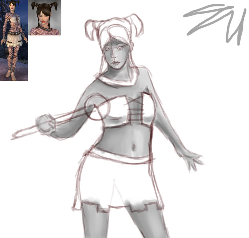
Decided I needed to draw/paint something...so doing a painting of my Monk. Going with the "greyscale first, color later" method...it's definitely helping me get the shading more realistic, so yay ^^ Obviously I am not yet done
 
|

|

|
 Apr 02, 2011, 04:37 PM // 16:37
|
#74 |
|
Desert Nomad
Join Date: Apr 2009
Guild: Trifecta Luminati [TRI]
Profession: W/
|
Bah, I was actually going for that same armor for my new monk toon last week. Ended up getting the Granite Citadel version instead.
Anyways, she's got a nice gesture to her. I think you can accentuate the S-curve on the left side of her stomach/hips to match up with how far her right right hip is pushing out. At the moment, her hips look a bit wide. Also, you can bring down the curve underneath her right breast because of that tilt in her shoulder. |

|

|
 Apr 03, 2011, 04:52 AM // 04:52
|
#75 |
|
Site Contributor
Join Date: Aug 2010
|
ooh, what dye combo are you using there? That's not just purple is it? I'm using a lime-green combo right now, but I don't really like how it looks anymore. I want to change it to something dark, but I don't know what :/
|

|

|
 Apr 03, 2011, 04:58 AM // 04:58
|
#76 |
|
Furnace Stoker
Join Date: Jan 2009
Guild: [SOTA]
Profession: D/
|
Haha, Charlie
 I love that armor, it's adorable. I want to get the Elite Woven as well, I think those two are my favorite Monk sets. I love that armor, it's adorable. I want to get the Elite Woven as well, I think those two are my favorite Monk sets. And thanks! I'll keep that advice in mind; I'm probably going to slim down her hips a bit and lengthen out her torso some more, which should help make her look less awkward.. Thistle - I can't remember exactly, but I believe it was purple+green. Which is like one of my favorite dye combos ever, I use it a lot. Labyrinthine is a pain in the ass to dye, though, I've noticed. Stupid pretty armor. Meant to work on the painting more today, but my guild leader and I wound up venturing into Fissure of Woe, so that sucked up more time than intended (we kept getting lost and did not do the quests in anything remotely resembling an efficient order. Whoops. I also started raging at spiders at one point). However, on the other hand, I now have Obsidian armor for my Dervish, something I thought I would never have. So yay ^^ |

|

|
 Apr 03, 2011, 05:05 AM // 05:05
|
#77 |
|
Site Contributor
Join Date: Aug 2010
|
|

|

|
 Apr 03, 2011, 08:12 PM // 20:12
|
#78 |
|
Furnace Stoker
Join Date: Jan 2009
Guild: [SOTA]
Profession: D/
|
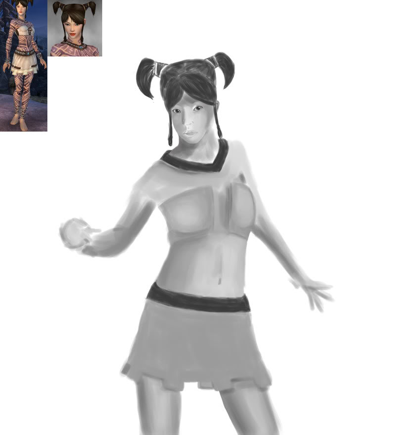
Thanks! And hehe, yeeeaaah. At one point I typed "EFFING SPIDERS STOP APPEARING" into guild chat XD Except I, ya know, didn't censor myself at all.
Did a bit more work - slimmed down her hips some and made her torso a bit longer, blobbed in the armor and her hair, and did a bit of work on the face. Her one ponytail seems a bit too high, but I think I'm gonna leave it that way, since getting those even in real life is nearly impossible  Still have done next to no work on her arms and hands and need to blob in her frog scepter. Still have done next to no work on her arms and hands and need to blob in her frog scepter. 
|

|

|
 Apr 04, 2011, 12:04 AM // 00:04
|
#79 |
|
Desert Nomad
Join Date: Apr 2009
Guild: Trifecta Luminati [TRI]
Profession: W/
|
Nice, though I miss that curve you see in the previous sketch on her right hip. Maybe you can angle her right leg closer to the left to help exaggerate that curving shape. I think that angled stance could help make the pose more interesting in comparison to how vertical that leg currently feels.
|

|

|
 Apr 04, 2011, 09:41 PM // 21:41
|
#80 |
|
Furnace Stoker
Join Date: Jan 2009
Guild: [SOTA]
Profession: D/
|
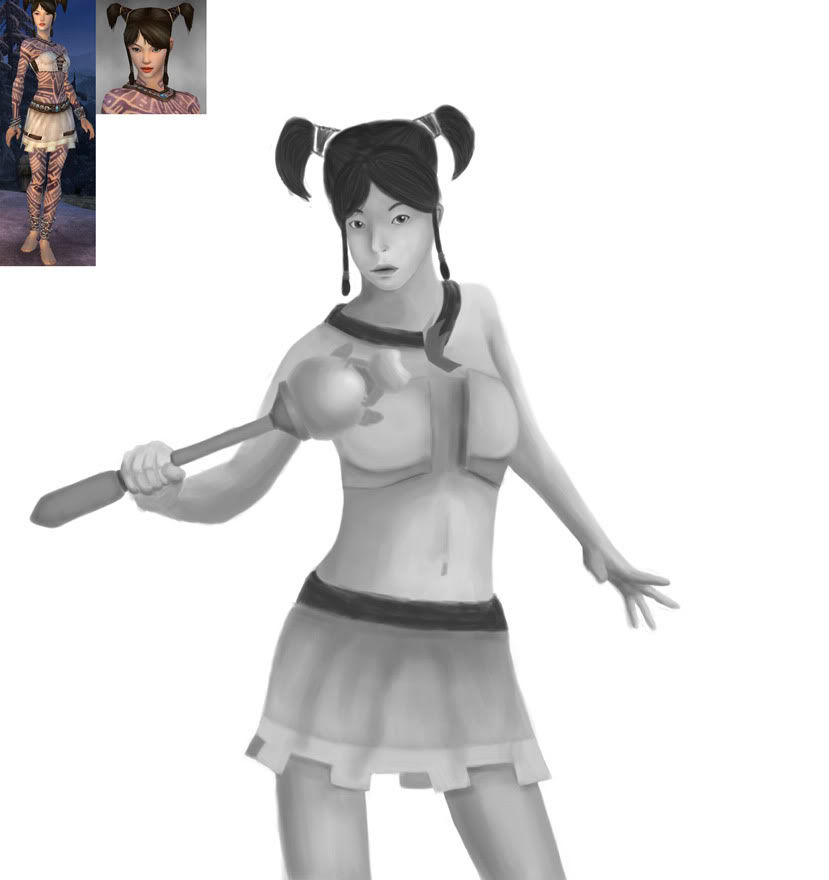
I tried angling her leg like you suggested, but couldn't get it to look right, so I left it as it was, and instead accentuated her waist a bit more and making her hip a bit wider on that side to make up for it.
Jewels and tattoos next...this will take a while. I like how the froggie turned out though ^^ 
|

|

|
 |
|
«
Previous Thread
|
Next Thread
»
| Thread Tools | |
| Display Modes | |
|
|
All times are GMT. The time now is 03:00 AM // 03:00.


 Linear Mode


