 |
|
 Oct 08, 2011, 06:55 AM // 06:55
|
#381 |
|
Site Contributor
Join Date: Jul 2008
Location: Dallas, TX. USA
Guild: Not in any guild at the moment
Profession: N/
|
@Obastable: Yeah, but I have so much to do IRL... And I get lost in drawing details so much anyway D: But I'll try
 Thanks ^_^ Good luck on making it in 2 days! O_O Thanks ^_^ Good luck on making it in 2 days! O_O@Maio: Just copy/paste the entry form from the first post, fill it out, and post it in your next post.  Awesome pic btw, coming along so nice! I like the way you color, and can't wait how the rit is gonna look! As for myself, I color blocked the sucker.... It looks horrible D: I also changed the lineart for the skirt, legs and boots a bit... and the faces... *sigh* |

|
 Oct 08, 2011, 05:01 PM // 17:01
|
#382 |
|
Jungle Guide
Join Date: Jul 2009
Guild: The Kurzick Mob [Mob]
Profession: R/
|
More progress...
 in more  Need to make the brown in the armor more prominent, in these pictures its much too saturated. Really trying to avoid pure black, to prevent some muddying I had last year doing that. Once I'm finished with the armor though, its smooth sailing from here. I -may- use pure black for the frill/whispy coat stuff, only because it needs to be visible against the night sky background (some shade of navy blue). But we'll see; id like to avoid it. Also realized I need to draw the moons face still. LOL |

|
 Oct 08, 2011, 06:49 PM // 18:49
|
#383 |
|
Ascalonian Squire
Join Date: Apr 2011
Location: Washington state
Profession: E/Mo
|
I'm gonna go ahead and throw my pumpkin into the arena and enter the contest, I'de say hat but i don't wear one..
Name:Maio Art Form: Drawing Idea: Maio's love for candy and pumpkins Progress Gallery: http://kthanya.deviantart.com/gallery/33089010 Real Life Prizes: [_] Official Contest: [_] Workshop Awards: [X] |

|
 Oct 08, 2011, 08:52 PM // 20:52
|
#384 |
|
Site Contributor
Join Date: Jul 2008
Location: Dallas, TX. USA
Guild: Not in any guild at the moment
Profession: N/
|
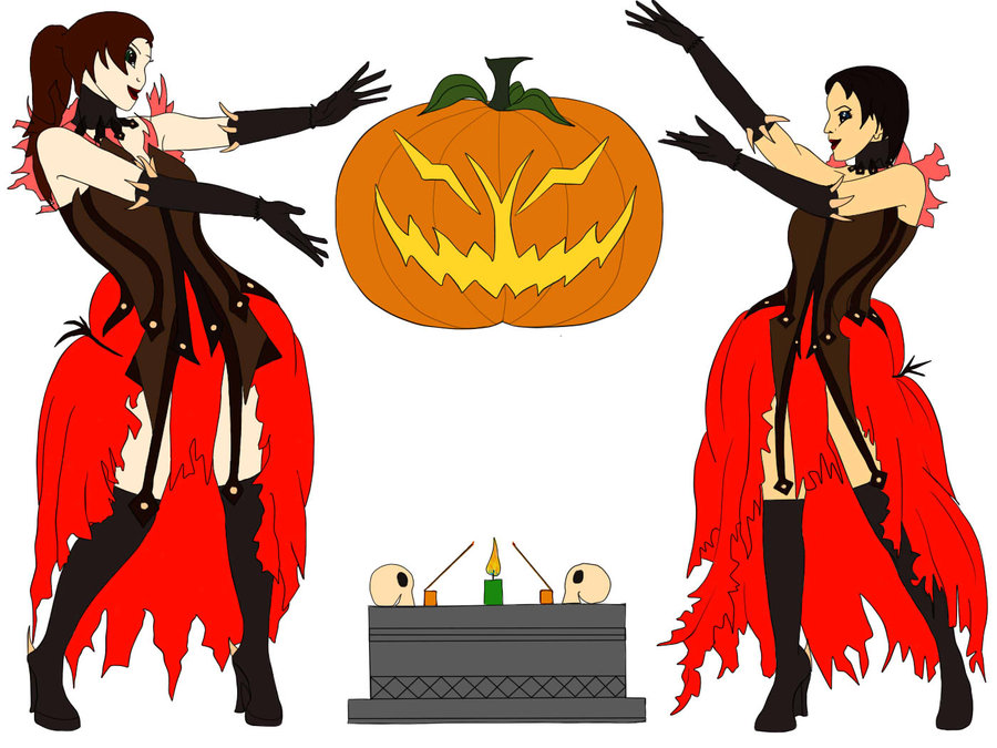
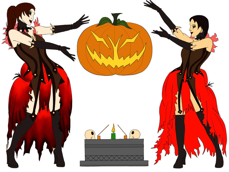
Started shading on the skirt. Now comes the other girl's skirt.
This is my favorite part, giving more color and depth to the picture  In my mind, it doesn't start coming together until this step. |

|
 Oct 08, 2011, 09:13 PM // 21:13
|
#385 |
|
Jungle Guide
Join Date: Jul 2009
Guild: The Kurzick Mob [Mob]
Profession: R/
|
Another quick update, some changes made:
 Started the shoulders... :/ The frills will be longer and more varied I think. But thanksgiving dinner 1 awaits. Will continue more tonight and tomorrow. Checklist: right shoulder, leg skirty cape thing, belt, sky, clouds, moon, cliff, face details maybe I'll finish on time... maybe... |

|
 Oct 08, 2011, 10:26 PM // 22:26
|
#386 |
|
Wilds Pathfinder
Join Date: May 2009
Location: Canadaa!
Guild: Last Friday Night [TGIF]
Profession: E/
|
Minami - D'awh -hug- :3 & ouuu! that's really coming together:3 I've always been a fan of just flat colours,probably cos its easier than adding shading xD D:
Aeronwen - :'D AWH THATS BEAUTIFUL -tear- Bebe - ty:3! obastable - happy Thanksgiving!! yaya canada ^__^ & thats a cute sketch xD Maio - Thas looking lovelyyyy Arrow - Omgg ;_; wao~ You can try mixing some black paint with lots of water to get a light layer n you can keep adding them to get a ..see through effect? D:> you can try on a diffpiece of material to see how it'll turn out though o wo |

|
 Oct 08, 2011, 11:07 PM // 23:07
|
#387 |
|
Ascalonian Squire
Join Date: Oct 2011
Profession: N/
|
Progress Update: Here are a few shots of the finished/baked Grenth statue. I really hate the face but I didn't want to spend too much time on it, and I think/hope that the paint job will make up for it. I did bake some mini jack-o-lanterns and a skull w/candle but I couldn't get a good picture of them -- it seems I must go buy a new camera. :/
|

|
 Oct 08, 2011, 11:52 PM // 23:52
|
#388 |
|
Lion's Arch Merchant
Join Date: Apr 2007
Location: Czech Republic-Prague
Guild: [LUST]
Profession: R/
|
bg mostly done. too tired and in a hurry to comment on anything else atm, sorry
 |

|
 Oct 09, 2011, 12:18 AM // 00:18
|
#389 |
|
Pre-Searing Cadet
Join Date: Oct 2011
Profession: E/
|
Name: Esparanza Orchid
Art Form: Cosplay Idea: Lady Althea goes trick-or-treating Progress Gallery: http://tkguildwarsplace.blogspot.com/ Real Life Prizes: [X] Official Contest: [X] Workshop Awards: [X] |

|
 Oct 09, 2011, 01:41 AM // 01:41
|
#390 |
|
Ascalonian Squire
Join Date: Apr 2011
Location: Washington state
Profession: E/Mo
|
Ive finished color blocking my Ritualist
You can see my progress gallery here i have left a little comment on how i go about my coloring. but i will post step by step progress for you guys too if you are curious at all. http://kthanya.deviantart.com/art/Mi...cked-262426929 |

|
 Oct 09, 2011, 01:42 AM // 01:42
|
#391 | |
|
Site Contributor
Join Date: Jul 2008
Location: Dallas, TX. USA
Guild: Not in any guild at the moment
Profession: N/
|
Quote:
EDIT: Next WIP thingie :3 Last edited by Minami; Oct 09, 2011 at 03:00 AM // 03:00.. |
|

|
 Oct 09, 2011, 03:02 AM // 03:02
|
#392 |
|
Krytan Explorer
Join Date: Jun 2009
Location: Tyria, Catacomb dweller..
Profession: N/
|
@Death by an arrow, Could you please fill me in on why you seem to be using multiple pieces? or is that a secret yet to be revealed, it's realy puzzling me... look ok though
 @Stouda, could you fill me in on howmany layers you used for that background, or estimate, i am trying to get that sketchy background to work, but somehow i seem to not get it right, and end up with a more clear picture, with obvious drawlines (though perhaps only vissible to me :P ) ... maybe a tuturial like couple of pics could help me in the future  @Maio, nice you joined in on the fray ^^ @Minami, any idea if Verene is MIA ? i send her a PM but no response yet, are you co-organizing? Right then my update for today, unfortunatly i went to gw2guru and got stuck in a conversation, which left me with way less time then i wanted  ... but made progress non the less ^^ ... but made progress non the less ^^Biggest problem atm. trying to create more distance in the little space i got left, i need to push the background and anything in it further away somehow, seeing i still need room to fit in the undead, and get my foreground scene setup with enough space for it (hence the fireplace as a way to check for distance and perspective... Fun detail, if any of you know Bob Ross, the painter, well i'm trying out his technique of setting up a painting from front to back and using 'little mistakes' to my advantage (helped with the mountains which are about 6 layers all in different oppasity and different shades of grey, which then had all things happening as light went over dark and the other way around ^^ ... did fix the mountains a bit, as it seemed to be split in two which was drawing a lot of attention in the middle of the picture, thus i closed the gap :P ... well lets hope i start drawing b4 visiting forums tomorrow and i might end up further than i did today :P Last edited by Arghore; Oct 09, 2011 at 03:08 AM // 03:08.. |

|
 Oct 09, 2011, 03:08 AM // 03:08
|
#393 |
|
Academy Page
Join Date: Jun 2005
Profession: W/E
|
FINALLY a break in weather, 2 hour set up and photo shoot.
I've got 100 pics to go through, shot in RAW, so here's just the first one off the camera run through default conversion. Last edited by UnOrthOdOx; Oct 09, 2011 at 03:13 AM // 03:13.. |

|
 Oct 09, 2011, 03:20 AM // 03:20
|
#394 |
|
Jungle Guide
Join Date: Jul 2009
Guild: The Kurzick Mob [Mob]
Profession: R/
|
Stouda; that is lookg absolutely magnificent
 I now see how all these things are coming togethor MUCH better. I see an official contest winner in that entry, I'm sure of it. I now see how all these things are coming togethor MUCH better. I see an official contest winner in that entry, I'm sure of it.@Arghore The reason there are multiple pieces/boards is because its all I had laying around. LOL, really thats it. Theyre those cardboard inserts inside binders, and I had them saved up after two years because they are the perfect size for taping down some paper to paint to prevent page curling while also being portable and lightweight. I had about 16-17 of them lying around and figured I would just take the 6 best ones and turn them into a bag canvas. Also, it helps when I want to hold something in a different light when painting or if I only need one board, then I can just take the individual one and use it. There are two to the right that arent shown because they arent being worked on atm; they contain the moon and the cliff.  @Esparanza Welcome to the workshop! I'm excited to see your althea cosplay come togethor  @Maio I really like the texture of the elementalists armor, fits rather nicely  The ribbon on her right leg (our left) should face a little more with the direction of her knee; right now both ribbons face the same direction even though one foot is turned. The ribbon on her right leg (our left) should face a little more with the direction of her knee; right now both ribbons face the same direction even though one foot is turned.@Marsh I will try to see what I can do with the water and the black. If it doesnt turn out, I can just use some pure black; itll just have to be VERY sparingly. @Rends With a little paint, that grenth should look great! Excited to see how the light turns out  @Minami the shading looks really nice. question: does the woman on the left have no nose? o__O I might suggest seperating the nose from the lip to add some shape. |

|
 Oct 09, 2011, 03:42 AM // 03:42
|
#395 |
|
Site Contributor
Join Date: Jul 2008
Location: Dallas, TX. USA
Guild: Not in any guild at the moment
Profession: N/
|
@DBA: Awh crap, I forgot to fix that... It's been bugging me, I have a layer set up for fix testing, but of course I forgot about it before I saved the jpg.... >_>
Next update will have it fixed ^_^ Thanks for pointing it out  @Unortodox: I can't wait for moar pics!!!! O_O Looks way so cool. @Arghore: I asked her on MSN now, and she said she's been swamped with work. She said she'll be able to catch up with everything tomorrow  ... ... I'm not co-organizing, since I haven't had enough time to be able to properly keep up with the workshop like that would require. :3 As it stands right now, I'm one of the judges, nothing more really 
|

|
 Oct 09, 2011, 03:57 AM // 03:57
|
#396 |
|
Krytan Explorer
Join Date: Jun 2009
Location: Tyria, Catacomb dweller..
Profession: N/
|
ok, tnx for the info Minami ^^ ... ill just wait and be patient
 ... ...GL everyone me needs sleepzzz now :P |

|
 Oct 09, 2011, 05:20 AM // 05:20
|
#397 |
|
Ascalonian Squire
Join Date: Apr 2011
Location: Washington state
Profession: E/Mo
|
Thanks Arrow, wish I would have caught that before coloring :P semi easy fix tho.
I fixed the ribbon on the ele and mostly finished the ritualist unless i find something wrong, i'm going to start on the background and foreground soon. Last edited by Maio; Oct 09, 2011 at 09:12 AM // 09:12.. |

|
 Oct 09, 2011, 10:03 AM // 10:03
|
#398 | |
|
Lion's Arch Merchant
Join Date: Apr 2007
Location: Czech Republic-Prague
Guild: [LUST]
Profession: R/
|
Quote:
 this is like my 5th one ever, 3rd one with tablet (yes, i did two with mouse, would not reccomend, it's awful) Buuut, here's screen of all my layers (so far): this is like my 5th one ever, 3rd one with tablet (yes, i did two with mouse, would not reccomend, it's awful) Buuut, here's screen of all my layers (so far): but they are mostly backups. And that's it i think. I also look at screenshots for reference ALL the time and have Navigator visible to see if i still like the overall look and feel of the picture while i work super zoomed on details. I hope this was atleast little helpful for you but they are mostly backups. And that's it i think. I also look at screenshots for reference ALL the time and have Navigator visible to see if i still like the overall look and feel of the picture while i work super zoomed on details. I hope this was atleast little helpful for you  ohh that would be so awesome, thanks man! But even if i finish in time (oops) those sexy real life sculptures will still totally kick any paintings ass |
|

|
 Oct 09, 2011, 02:49 PM // 14:49
|
#399 |
|
Krytan Explorer
Join Date: Jun 2006
Location: Netherlands
Guild: [OBEY]
Profession: N/R
|
@UnOrthOdOx Yay for the weather!!! and the pic looks great.
@Stouda01 Wow, that's coming along very nice, and to think that comes from that messy sketch, just wow! I finally finished the mad king himself just one more detail and I won't have to touch him again. Working on the right side of the set now still not clear what it will be. My first thought was a tomb (the one we sacked in last years quest for the body), but that would just be a gray block. The Nightmare was almost done untill his arm broke in the oven :S Ah well, will finish him after dinner. For now I'll leave you with His Royal Highness: The rest of the pics are in my progress gallery, not many how to's for the mad king though. The head and crown took me over 2.5hrs and I really needed some sleep 
Last edited by Odinius; Oct 09, 2011 at 02:52 PM // 14:52.. |

|
 Oct 09, 2011, 03:48 PM // 15:48
|
#400 |
|
Jungle Guide
Join Date: Jul 2009
Guild: The Kurzick Mob [Mob]
Profession: R/
|
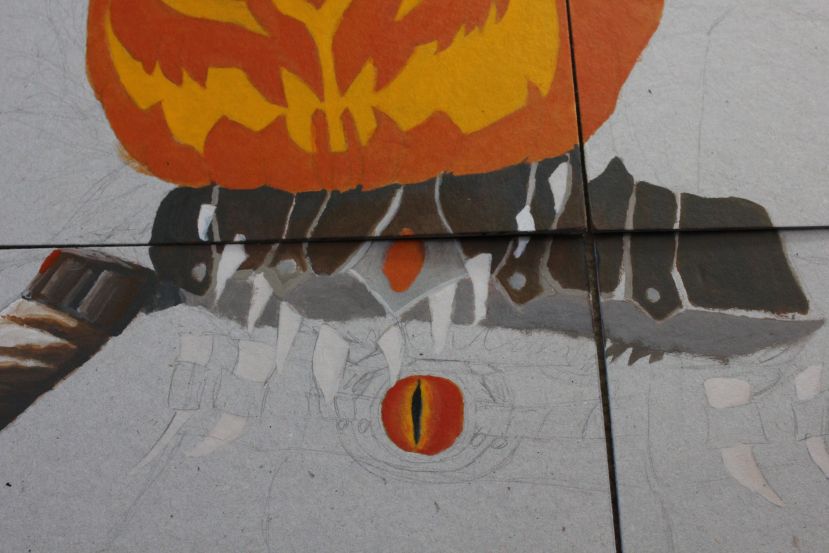
More progress:
 Most deffinatly need to shrink that arm down, or atleast that shoulder. :S |

|
 |
|
«
Previous Thread
|
Next Thread
»
| Thread Tools | |
| Display Modes | |
|
|
All times are GMT. The time now is 02:46 AM // 02:46.


 Linear Mode


