 |
|
 Sep 12, 2006, 07:28 PM // 19:28
|
#21 |
|
Frost Gate Guardian
Join Date: Jun 2006
|
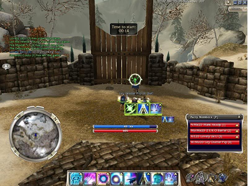
~mainly for warrior since thats what i usually play, but when playing mesmer, monk, interrupt ranger, and others its held up just fine ~skills 1-4 are usually spam heal or adren spike skills, 5-8 less-often used skills and my weapon slots right up top near them for clicking ~effects bunched up in bottom left, can show max of 10 in that corner |

|

|
 Sep 12, 2006, 10:34 PM // 22:34
|
#22 |
|
Krytan Explorer
Join Date: Feb 2005
|
|

|

|
 Sep 12, 2006, 11:16 PM // 23:16
|
#23 |
|
Wilds Pathfinder
Join Date: Jan 2006
Location: Dublin, Ireland
|
|

|

|
 Sep 12, 2006, 11:33 PM // 23:33
|
#24 |
|
Desert Nomad
Join Date: Feb 2006
Location: USA: liberating you since 1918.
|
Thought I'd contribute...
Broad field of vision Big enemy skill display for smart, quick interrupts Otherwise, managable. I play monk and warrior primarily. |

|

|
 Sep 12, 2006, 11:35 PM // 23:35
|
#25 | |
|
Forge Runner
Join Date: Nov 2005
|
Quote:
|
|

|

|
 Sep 12, 2006, 11:50 PM // 23:50
|
#26 |
|
Academy Page
Join Date: Mar 2006
Guild: Project Teamwork [ptw]
Profession: Mo/
|
Everytime I used to get a brilliant interface idea and change it - I would end up going back to default after a few games.
Basically, You train your eyes where to look and no matter what position they are on the screen you will have to move you eyes from the battlefield to your party to your skill bar to your effects monitor all through the game. So I found that stick with what you know best which was default with a few minor little changes i.e removing exp and stuff u dont need. |

|

|
 Sep 13, 2006, 12:24 AM // 00:24
|
#27 |
|
Krytan Explorer
Join Date: Dec 2005
|
unobstructed field of vision ftw:
|

|

|
 Sep 13, 2006, 01:17 AM // 01:17
|
#28 | |
|
Elite Guru
 Join Date: Sep 2005
Location: Manchester, England
Guild: SMS/Victrix
|
Quote:
|
|

|

|
 Sep 13, 2006, 08:57 AM // 08:57
|
#29 | |
|
Krytan Explorer
Join Date: Aug 2005
Guild: EaT
Profession: Mo/
|
Quote:
skill 8 = q 6 is basically the least used skill so there u have it... |
|

|

|
 Sep 14, 2006, 10:49 AM // 10:49
|
#30 |
|
Ascalonian Squire
Join Date: May 2005
Location: The Netherlands
Guild: Fairly Harmless
Profession: D/A
|
This interface works best for me, because it allows me to see all enchantments and hexes continuously.

|

|

|
 Sep 17, 2006, 06:17 PM // 18:17
|
#31 |
|
Banned
Join Date: Apr 2005
|
also revamped my interface hours ago and will take time to get used to it. but definitely it's better than my old interface. why?
enLarged skill bar - since im basically a mouseclick2x player, i dont wanna misclicks to happen. there were times that i clicked troll unguent instead of distortion because my old interface had small skill bar health bar and energy bar - *look above party list - now i can see the whole name of each party member at least :/ compass - this is the big change. my last interface had the compass on the right top corner. reasons why? to make room for important bars. and i made it slightly bigger so clearer view of where things are. still getting used to looking at the left hand side target health bar - ever wondered why targets still not die even if their health is like 1/16 of their health bar? lengthen it ftw. Enemy and My skill activation - i observed that the shorter the skill activation bar of your enemy target, the less chance youll land an interrupt. so i made it longer plus i put my skill activation bar on top so ill be able notice if my target is using a skill while im also using a skill. Effects/conditions window - on top of course. made it wider Enchant maintain bar - on top of my skill bar for easy access. weapon sets - easier access now. yes, my interface items are big that it covers almost 1/6 of my screen, possible blocking important battle views. but thanks to my bigger compass. Last edited by tomcruisejr; Sep 17, 2006 at 06:20 PM // 18:20.. |

|

|
 Sep 17, 2006, 06:25 PM // 18:25
|
#32 |
|
Desert Nomad
Join Date: Apr 2006
|
I never changed mine up from the default
|

|

|
 Sep 18, 2006, 12:42 PM // 12:42
|
#33 |
|
Academy Page
Join Date: Jul 2006
Location: Australia, mate.
Guild: Clan WASD[WASD]
Profession: E/Mo
|
Wow tomcruisejr, that interface is crazy! And even more unconventional is the position of the skills on your skillbar. Very interesting.
|

|

|
 Sep 18, 2006, 01:23 PM // 13:23
|
#34 |
|
Ascalonian Squire
Join Date: May 2005
Location: Amsterdam
Guild: Bubblegum Dragons [GUM]
|
Interface was originally designed for the use with a monk, but now i also play other professions like Necro, Elementist. - one area where I can see everything. - short distance from between the skills and the party screen for mouse click. - on 1,2 and 3 I always put the fast skills, like interrupts or infuse for fast access through the 1,2,3 keys on keyboard. - extra big icons for the maintained enchantments for easy removing. (Life bond, barrier and holy veil.) - walking, targeting, etc with keyboard. Party screen selection with mouse. Some times walking with mouse. Last edited by jurrit; Sep 18, 2006 at 01:25 PM // 13:25.. |

|

|
 Sep 18, 2006, 11:45 PM // 23:45
|
#35 |
|
Lion's Arch Merchant
Join Date: Oct 2005
Location: San Francisco
Profession: W/Mo
|
Holy crap. Your chat box is huge.
|

|

|
 Sep 19, 2006, 02:35 AM // 02:35
|
#36 |
|
Ascalonian Squire
Join Date: Jun 2006
Profession: W/E
|
Ok here is my UI (pls don't mind the build is just for ra fun)
At first i planned for playing warrior in gvg but i've tested and i've been very comfortable in using it also in any caster role. The best advantages of it is that you can easily swap from clicking targets to clicking skills and at the same time see whats going on around you . *edit o and effects are located right above the hp bar . Last edited by Ikoma; Sep 19, 2006 at 02:37 AM // 02:37.. |

|

|
 Sep 19, 2006, 05:21 AM // 05:21
|
#37 |
|
I'm back?
Join Date: Sep 2005
Location: Here.
Guild: Delta Formation [DF]
Profession: W/E
|
Here's mine. Note that I play in almost double the resolution of this screenshot.

|

|

|
 Sep 19, 2006, 07:24 AM // 07:24
|
#38 |
|
Re:tired
Join Date: Nov 2005
Profession: W/
|
Don't you find your target bar is a bit far up? I know most of the Warriors I know prefer it more central. It's a decent size though I guess.
|

|

|
 Sep 19, 2006, 07:35 AM // 07:35
|
#39 | |
|
Wilds Pathfinder
Join Date: Jan 2005
|
Quote:
|
|

|

|
 Sep 19, 2006, 07:58 AM // 07:58
|
#40 | |
|
I'm back?
Join Date: Sep 2005
Location: Here.
Guild: Delta Formation [DF]
Profession: W/E
|
Quote:
|
|

|

|
 |
|
«
Previous Thread
|
Next Thread
»
| Thread Tools | |
| Display Modes | |
|
|
All times are GMT. The time now is 07:48 PM // 19:48.


 Linear Mode


