 |
|
 Feb 17, 2006, 09:00 PM // 21:00
|
#1 |
|
Lion's Arch Merchant
Join Date: Oct 2005
Guild: Fortune Cookie [LucK]
Profession: N/
|
Proposing some ideas to change the way we zone in and out of pvp and pve areas.
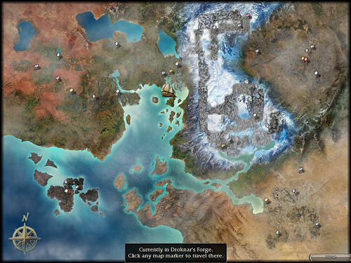
Current situation to zone into islands: When we click on the ship icon, we are presented with a menu that only leads to the great temple and the option to choose the district as shown below.  Suggestions Add the arenas in the menu or change it totally by just presenting us the islands map straight away after clicking on the ship icon.  Current situation to zone out of islands: When we click on the ship icon, we are presented with a menu that only leads to Lion Arch and the option to choose the district as shown below.  Suggestion: Add the towns in the menu or change it totally by just presenting us the overall zoomable map straight away after clicking on the ship icon.  What do you guys think? Last edited by Eve; Feb 17, 2006 at 09:49 PM // 21:49.. |

|

|
 Feb 17, 2006, 09:04 PM // 21:04
|
#2 |
|
Frost Gate Guardian
Join Date: Oct 2005
Location: Currently vacationing in reality....
Guild: Sith Jedi [SJ]
|
I agree, dont like chosing something from a menu with only one option. Perhaps this is something that is just awaiting content from Factions though.

|

|

|
 Feb 17, 2006, 09:15 PM // 21:15
|
#3 |
|
Furnace Stoker
Join Date: Jun 2005
Location: United States
Guild: Dark Side Ofthe Moon [DSM]
Profession: E/
|
I know the battle isles is the interconnect for C1 <-> C2 cross over if you own both versions. So it does make sense when you warp out to choose Lions Arch or the "port" in C2.
I would personally like a button that flips the map between (c1/c2). I do like the idea about the arena warp on the list when yo go in. |

|

|
 Feb 17, 2006, 09:21 PM // 21:21
|
#4 |
|
Krytan Explorer
Join Date: Aug 2005
Location: Sunshine Coast, Australia
Guild: Soul Crusaders
|
Yeah, i like this. I was kinda annoyed at that stupid travel thing...
|

|

|
 Feb 17, 2006, 09:46 PM // 21:46
|
#5 |
|
Krytan Explorer
Join Date: Sep 2005
|
Yeah, I hate that it's a two-step to go from PvE to an Arena.
|

|

|
 Feb 17, 2006, 10:17 PM // 22:17
|
#6 |
|
Academy Page
Join Date: Aug 2005
Location: Canada
Guild: Mystic Masters of Gaia
Profession: Mo/
|
Yes, I'd like something to be done about this too.
Your idea makes complete sense when warping into the Battle Isles. But when warping out, I'm afraid the list would get too lengthy with all the towns to choose from (especially after chapter 2). So it might work better another way. Not to mention most towns can't be reached by boat. Hehe. Then again, a lot of things don't make sense in the game already, like dwarves that are almost as tall as the average player -- especially the females. Simply clicking the boat and revealing the world map is good enough for me. Maybe have 2 boats in Battle Isle (after chapter 2)? So according to which one you click, the corresponding map shows up. But later on with all the new chapters, we're going to have one crowded harbour. /ponder |

|

|
 Feb 17, 2006, 11:13 PM // 23:13
|
#7 |
|
Wilds Pathfinder
Join Date: Jul 2005
|
Loads go so fast that I don't mind but this is a good idea for those with slower computers.
/sign |

|

|
 |
|
«
Previous Thread
|
Next Thread
»
| Thread Tools | |
| Display Modes | |
|
|
 Similar Threads
|
||||
| Thread | Thread Starter | Forum | Replies | Last Post |
| User Interface for fast acting Monks. | Homsar | Gladiator's Arena | 31 | Feb 13, 2006 05:09 AM // 05:09 |
| User Interface MOD? | bockoven | Questions & Answers | 2 | Dec 18, 2005 07:10 PM // 19:10 |
| New User Interface: Search | Kirbie | Sardelac Sanitarium | 0 | Nov 02, 2005 03:08 AM // 03:08 |
| Not Very User-Friendly. | GhostPoet | Sardelac Sanitarium | 10 | Aug 10, 2005 04:17 AM // 04:17 |
| Quest/ Mission Listing User Interface | dbodenheim | Sardelac Sanitarium | 1 | May 12, 2005 10:25 AM // 10:25 |
All times are GMT. The time now is 10:10 PM // 22:10.


 Linear Mode


