 |
|


 Jan 25, 2006, 07:55 AM // 07:55
|
#1 |
|
Ascalonian Squire
Join Date: May 2005
Location: Sydney, Australia
Guild: AFX
Profession: E/Mo
|
 Guildwars Signature
 this is my first guildwars signature..hope u like it this is my first guildwars signature..hope u like it  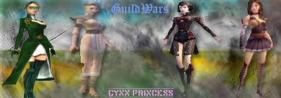 Please comment on it either crap or sexy (ahha anythings) Thanks in advance 
Last edited by Cynn Princess; Jan 26, 2006 at 03:30 AM // 03:30.. |

|

|
|
Jan 25, 2006, 09:49 AM // 09:49
|
#2 |
|
Jungle Guide
Join Date: Apr 2005
Location: Perth, Australia
|
It looks good, jsut make it your signature now

|
|
|
|
|
Jan 25, 2006, 12:43 PM // 12:43
|
#3 |
|
There is no spoon.
Join Date: Jun 2005
Location: Netherlands
Profession: Mo/
|
You should make a 1 pixel black border around every signature you make, that makes it look way better. Also, you should try fading the character into the background, that always look great in my opinion.
Pretty nice anyway though! Love the background.
|
|
|
|
|
Jan 25, 2006, 01:38 PM // 13:38
|
#4 |
|
Forge Runner
Join Date: Jun 2005
Location: http://tinyurl.com/4g5ueb8
Guild: Put the peanut in the peanut hole!
|
cute^^ i like the background :P
and yeh.. i agree, you should add a 1px border.. makes it much neater ^^ |
|
|
|
|
Jan 25, 2006, 07:25 PM // 19:25
|
#5 |
|
Krytan Explorer
Join Date: Jan 2006
Location: Wisconsin
Guild: dth
|
Not bad, although I don't really like the font on the bottom
just my opinion.
|
|
|
|
|
Jan 25, 2006, 09:01 PM // 21:01
|
#6 |
|
Pre-Searing Cadet
Join Date: Jan 2006
Location: St. John's, Newfoundland
Guild: Shining Blade Forgotten Hope
Profession: E/Mo
|
Yeah, it's not bad but Temptress is right, a 1px border would make it tidier looking.
|
|
|
|
|
Jan 25, 2006, 10:15 PM // 22:15
|
#7 |
|
Desert Nomad
Join Date: Aug 2005
Guild: Scars Meadows [SMS], Retired Officer
Profession: W/
|
it's crap.
ok, i'm just joking. it's not bad, but it could use some work. #1 - as some people have said, a border will help define it. #2 - someone already mentioned this as well, but the font seems out of place. the font choice itself is ok, but maybe work on the colors? also, it seems a bit flat. by this, i mean that it's just plain flat text slapped on with 3d texture pics. maybe if you added some type of effect to offset it, it might give it a better feel. #3 - the image itself feels cramped. this could be because the figures all span the height of the image itself. it might help if you added a bit of variety and left some cushion room, perhaps between their heads and the top of the sig. it might help to add variety and not try to make it so uniform, as well. be sure that when you resize an image, you keep the scale. anyway, those are just a few suggestions. don't take them too seriously. not a bad start though. |
|
|
|
|
Jan 25, 2006, 10:22 PM // 22:22
|
#8 |
|
Desert Nomad
Join Date: Apr 2005
|
Do a 1 pixel black border, 2 Pixel white border, and a 3 pixel black border, is that how you do it to make the cool ass borders with like clear in the middle?
|
|
|
|
|
Jan 25, 2006, 10:34 PM // 22:34
|
#9 | |
|
Desert Nomad
Join Date: Aug 2005
Guild: Scars Meadows [SMS], Retired Officer
Profession: W/
|
Quote:
|
|
|
|
|
|
Jan 26, 2006, 03:29 AM // 03:29
|
#10 |
|
Ascalonian Squire
Join Date: May 2005
Location: Sydney, Australia
Guild: AFX
Profession: E/Mo
|
wow..thanks for the idea...i'll try my best next time ^^
|
|
|
|
|
Jan 27, 2006, 09:22 AM // 09:22
|
#11 |
|
Krytan Explorer
Join Date: Jul 2005
Profession: Mo/W
|
I made a sig of Kago. ^^
Had a hard time cutting the image cause the background was fishermen's haven, and it was dark. xDDD |
|
|
|
|
Feb 02, 2006, 02:28 AM // 02:28
|
#12 |
|
Lion's Arch Merchant
Join Date: Jul 2005
Location: Florida USA :)
Guild: [Anti]
Profession: W/E
|
|
|
|
|
 ..
..
|
Feb 02, 2006, 03:35 AM // 03:35
|
#13 |
|
Forge Runner
Join Date: Oct 2005
Profession: W/
|
kago, howd u get that background? i cant figure it out how to get any background :|
|
|
|
|
|
Feb 02, 2006, 05:28 AM // 05:28
|
#14 |
|
Krytan Explorer
Join Date: Jul 2005
Profession: Mo/W
|
I used photoshop, and did "Render > Clouds" Then started painting it with random brushes. :P
|
|
|
|
|
Feb 02, 2006, 06:38 AM // 06:38
|
#15 |
|
Krytan Explorer
Join Date: Oct 2005
Profession: R/Me
|
i like one were it has neat border and chars at top, his an attempt by me
|
|
|
|
|
Feb 02, 2006, 07:25 AM // 07:25
|
#16 |
|
Wilds Pathfinder
Join Date: Jul 2005
|
Here's mine:
Still working on sizeing but I think its a nice start. |
|
|
|
|
Feb 02, 2006, 10:54 AM // 10:54
|
#17 |
|
Lion's Arch Merchant
Join Date: Jan 2006
Guild: N/A
|
that must suck posting the link all the time. Why did the admin decided to get rid of sigs?
|
|
|
|
|
Feb 03, 2006, 12:16 AM // 00:16
|
#18 |
|
Forge Runner
Join Date: Oct 2005
Profession: W/
|
elrond how did you do that background and border? :|
|
|
|
|
|
Feb 03, 2006, 10:33 AM // 10:33
|
#19 |
|
Krytan Explorer
Join Date: Oct 2005
Profession: R/Me
|
hmmmm......okie ill explain...if you don't get it pm me
with the background i used brushes downloaded from diviantart.com just brush them around abit till you get something you like. with the border, just cut out a shape with polygon tool, then fill it with black, then go to blending options and play with bevel/emboos |
|
|
|
 |
|

«
Previous Thread
|
Next Thread
»
| Thread Tools | |
| Display Modes | |


 Linear Mode

|
|

 Similar Threads
|
||||
| Thread | Thread Starter | Forum | Replies | Last Post |
| Signature Skills | Symeon | Sardelac Sanitarium | 79 | Jun 20, 2007 02:06 PM // 14:06 |
| The undead Mesmer | Nolani Academy of Arts | 13 | Nov 26, 2005 01:56 PM // 13:56 | |
| Signature Question. | Lansing Kai Don | Off-Topic & the Absurd | 4 | Apr 07, 2005 11:43 PM // 23:43 |
All times are GMT. The time now is 03:48 AM // 03:48.
