 |
|


 Apr 27, 2007, 04:32 PM // 16:32
|
#21 | |
|
Site Contributor
Join Date: Oct 2006
Location: Finland
Guild: Runners of the Rose [RR]
Profession: R/
|

Quote:
So yeah... backgrounds are excellent if you think you can pull it off, but there's a high chance you will lose points for it too if there's even a single, distracting element in there. The judges are pretty perceptive and can easily reduce your points because of a background they don't like. Of course, they also expect you to pick a good background for the shot that doesn't distract too much, so that's why it's kind of like a double-edged knife.... Of course, I like me backgrounds....: Ember, oh wow, you have a really interesting pose in your first pic!  I love it! The background could be a bit better, but your model really dominates that image. Good job. I love it! The background could be a bit better, but your model really dominates that image. Good job.Sihaya, your necro is so cute... she doesn't look necroishly scary at all. 
|
|

|
|
Apr 27, 2007, 07:54 PM // 19:54
|
#22 | |
|
Wilds Pathfinder
Join Date: May 2006
Guild: The Agonized
Profession: Rt/Mo
|
Quote:
http://i134.photobucket.com/albums/q...06/Boss811.jpg Good luck cycle two'ers!! BTW. I'm contemplating applying my necro for future TNTM cycles... do you guys think she seems decent enough? I'm having a little trouble with the dark skin (I understand your struggles now, Perynne!) but overall, I like her a lot. |
|
|
|
|
Apr 27, 2007, 08:22 PM // 20:22
|
#23 | |
|
Wilds Pathfinder
Join Date: Mar 2007
Location: Finland
Profession: R/
|
Quote:
Remember it's not just the dark skintones that cause trouble, very light skintones have also a tendency to burn if made to face actual light so the light has to be very weak where as to dark skinned characters require strong light. (I had some burning issues with my monk, her face would just burn and becaume a horrible shade of yellow because the base of her skintone is already yellowish...) Ofcourse problems can also be solved by adjusting game settings...try adding a little gamma, uncheck and check options etc. 
|
|
|
|
|
Apr 27, 2007, 09:47 PM // 21:47
|
#24 | |
|
Wilds Pathfinder
Join Date: May 2006
Guild: The Agonized
Profession: Rt/Mo
|
Quote:
Necro <3 I like the necro in your avatar, post some pictures of her!! |
|
|
|
|
Apr 28, 2007, 04:05 AM // 04:05
|
#25 | |
|
Site Contributor
Join Date: Oct 2006
Location: Finland
Guild: Runners of the Rose [RR]
Profession: R/
|
Quote:
As for cropping, it all depends on what you want to emphasize. If it's the general mood (like in this Calendar-assignment) a wide crop can really help. If you want to concentrate on what your model is doing and what objects are important to the shot (like the Boss-assignment and Signature Pose-assignment last cycle) then a close crop is called for. After all, a crop is meant to emphasize the things you feel are important to a shot, and leave anything extra out. Oh gosh, I feel so pioneer-ish now. Been in only one cycle, and already I feel like an old know-it-all (and still make the same mistakes sometimes in my own shots). *old granny voice* "Yeeeah, that's how we took the shots back in my modeling days.... you young 'uns are still so new to it all... played it safe, tested the icing so to speak..." Nobody had done anything like this before in the forums, so it was exciting to learn what was good and what was not. |
|
|
|
|
Apr 28, 2007, 07:49 AM // 07:49
|
#26 |
|
are we there yet?
Join Date: Dec 2005
Location: in a land far far away
Guild: guild? I am supposed to have a guild?
Profession: Rt/
|
yes light skinned models have it just as tough......part of why I never even thought about using my ele (see the image)....and my gamma is low....she is always like that! (I have even worse images from long ago ----but they are almost too hard to even look at).
I try to take images when she is in the shadow and she just GLOWS.....ah well.... (image was just for fun, just to show problems of the model---I think she was begging for the shot to turn out better.) Last edited by cosyfiep; Jul 12, 2007 at 06:29 AM // 06:29.. |
|
|
|
Apr 28, 2007, 12:26 PM // 12:26
|
#27 |
|
Elite Guru
 Join Date: Feb 2007
Location: Luxembourg
Guild: DVD Forums [DVDF]
Profession: Me/
|
Awww so much for my test :/ didn't think it would sink me so low
 I wanted to test if the Jurys would find me kinda cute if i looked tired or more like uninterested/bored...and it seems the latter came out wich had no good impact at all . And not having answered the question made things so much worse ... Heres a shot that would have been so much better :/ 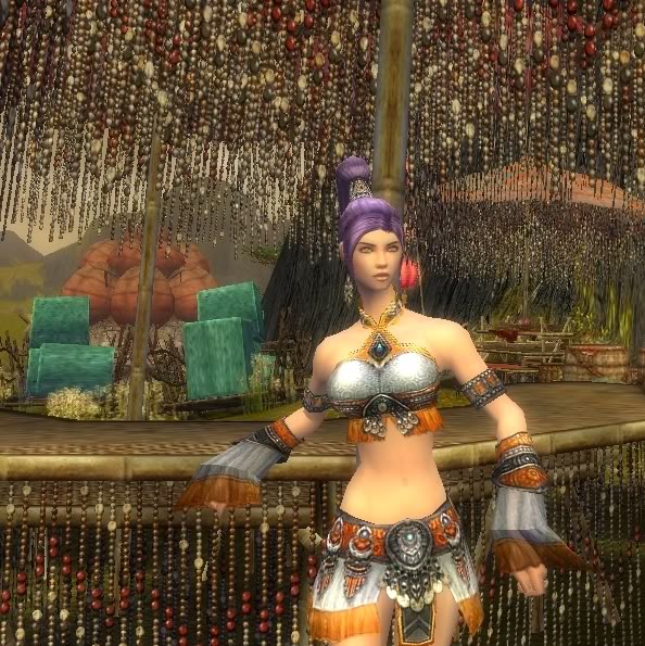 mmm lets wait and see... i don't think i have many chances left to make it trough this round but ohh well...i just can hope the judges will be forgiving and I'll still make it.... Owww well... What's done is done. Last edited by Oogami; Apr 28, 2007 at 12:31 PM // 12:31.. |
|
|
|
Apr 28, 2007, 03:49 PM // 15:49
|
#28 |
|
Site Contributor
Join Date: Oct 2006
Location: Finland
Guild: Runners of the Rose [RR]
Profession: R/
|
Oogami, I have to say that I think the other shot is better. This one has too much small detail that distracts the viewer from your model. All the beads look very distracting and I can't keep my eyes focused on your model at all. It's a very pretty shot and I love the location, but it just doesn't work for a model image.
Closer cropping might have helped a little bit, but the background is still quite problematic for a model shot. I don't get much of your month out of this either. Remember that no matter how beautiful a shot is, you will not be getting points for it if it doesn't fit the assignment. On the other hand, I'd love to visit the location and check out the cool beaded table. Where did you take it? Looks like Luxon area somewhere...? Your model also looks really beautiful, I'm sure there are plenty of locations where she can shine.
|
|
|
|
Apr 28, 2007, 04:04 PM // 16:04
|
#29 | |
|
Elite Guru
Join Date: Feb 2007
Location: Luxembourg
Guild: DVD Forums [DVDF]
Profession: Me/
|
Quote:
The location is Boreas Seabed. And thanks allot for your Advice! I'll try to keep it in mind as much as possible when doing shots where i want my character to stand out the most
|
|
|
|
|
Apr 29, 2007, 11:18 AM // 11:18
|
#30 | |
|
Wilds Pathfinder
Join Date: Mar 2007
Location: Finland
Profession: R/
|
Quote:
 Oogami, I love the Luxon theme. I've thought about sometimes taking screenies in similiar places. Gotta love the red/cyan color themes there. I don't find the beads themselves that distracting and I like how you outsmarted the table with your pose. I do find that the beads are maybe a tad ugly in color and I think if the background color was more appealing and the horizon was completelly clean of all those jade blocks and turtles etc. with maybe just a grassy hill this pic would look really good. On other things...Just as I had gotten my monkmonk some new armor and was contemplating on the dyes I spotted a gorgeous lightspot ingame and went a bit screeniehappy over it. Photoshoot 02 sounds very challenging! But I'll be sure to try out something in my corner if I can find the time. I liked several of the themes. I hope weget to see some other non-contestant entries here too. Can't wait to see what people come up with and posing with another is sure to make it more dificult. Last edited by Nian; Apr 29, 2007 at 12:41 PM // 12:41.. |
|
|
|
|
Apr 29, 2007, 01:44 PM // 13:44
|
#31 | |
|
Elite Guru
Join Date: Feb 2007
Location: Luxembourg
Guild: DVD Forums [DVDF]
Profession: Me/
|
Quote:
On a side note.. i was so sure you would make it into the final 12...Your monk is really cute and i like your shots so far.They look pretty clean. peww next assignment is gonna be really hard....i gotta get one of the best pictures.... i was really lucky i survived the first assignment...but if i mess up again on this one ... this time I'll definately gonna be kicked out. |
|
|
|
|
Apr 29, 2007, 01:57 PM // 13:57
|
#32 | |
|
Lion's Arch Merchant
Join Date: Jan 2007
Location: Belgium, Europe
Guild: Grenth's Rejects [GR]
Profession: N/Me
|
Quote:
I designed her to look like me, in a way. I didn't like any of those 'scary' faces... This was the strongest looking one
|
|
|
|
|
Apr 29, 2007, 07:38 PM // 19:38
|
#33 | |
|
Elite Guru
Join Date: Feb 2007
Location: Luxembourg
Guild: DVD Forums [DVDF]
Profession: Me/
|
Quote:
|
|
|
|
|
Apr 29, 2007, 08:01 PM // 20:01
|
#34 |
|
Academy Page
Join Date: Dec 2005
Location: Middle Of No Where
Guild: (GODS)
Profession: Me/
|
Little Mermaid Re-Made
Well I deicded to remake my derv, and now her name is Anastacia Duquette!
Despite her name, I decided to try out Ariel. Heh, Instead of real water I chose the Jade GH thinking it would be easier to work with... well it wasn't. Here was my best shot: So I think I might need an explanation: I thaught the istani armor made an excellent mermaid guise. Im sure some people would question the fact that I left in the sparkleys and had her face darker. Wel I thought the sparkles added a storybook, kind of magical feel. And in the scene, i beleive she leads with her, so it figures it would be lighter, and besides the face still retains visibility. |
|
|
|
Apr 29, 2007, 08:36 PM // 20:36
|
#35 | |
|
Lion's Arch Merchant
Join Date: Jan 2007
Location: Belgium, Europe
Guild: Grenth's Rejects [GR]
Profession: N/Me
|
Quote:
White Wolfgang, I think the istani armour is an excellent choice  I think it would look even better in blue though
|
|
|
|
|
Apr 29, 2007, 10:30 PM // 22:30
|
#36 | |
|
Krytan Explorer
Join Date: May 2006
Guild: Silver Millenium
Profession: E/Me
|
Quote:
What a fun thread! Hope to see some potential future applicants here! |
|
|
|
|
Apr 29, 2007, 10:52 PM // 22:52
|
#37 | |
|
Academy Page
Join Date: Dec 2005
Location: Middle Of No Where
Guild: (GODS)
Profession: Me/
|
Quote:
 I actually find this shoot tough entirely because it is hard to represent each princess in game. If I knew that my shot was little mermaid it would make sense. But if I had no prior knowledge, the thought wouldn't have crossed my mind I actually find this shoot tough entirely because it is hard to represent each princess in game. If I knew that my shot was little mermaid it would make sense. But if I had no prior knowledge, the thought wouldn't have crossed my mind Although Im sure the amazing contestants will pull it off Although Im sure the amazing contestants will pull it off Anyways Nian I love that shot, especially for the lighting! The ribbons on your wrist and in your hair add motion to a otherwise stiff pic. The only thing I would change is the cropping The pic is kinda large, and the top sky part is rather unnoticeable, so maybe crop it a bit shorter. Great pics everyone
|
|
|
|
|
Apr 30, 2007, 12:01 AM // 00:01
|
#38 | ||
|
Wilds Pathfinder
Join Date: Mar 2007
Location: Finland
Profession: R/
|
Quote:
 In your photoshoot 01 picture I personally like the strong contrast a lot. The sky certainly is beautiful and I find the pose cute too but I suppose just like my pic above it kind of lacks the being posey and modeling aspect. Quote:
Yes I agree the pose is not very active at all and I don't even like it that much. I was simply taken by the lightning spot and wanted it exact so if I posed much the light would have disappeared from the face. Sometimes the greatest spots are so hard to use!Nice idea for the Ariel shot you have there. That's very well thought out. I can't say the clipped out hands don't bother me a bit because it's just the hands that get clipped. It might look different with the clipping happening from elbows down imho. 'Course Vabbian top would be the perfect mermaid top here but if you just re-made your Dervish then that's probably out of the questiion. Hope my english made some sense and don't mind the typos. It's pretty late where I'm at and I think I'm off to bed now. xp |
||
|
|
|
Apr 30, 2007, 01:38 AM // 01:38
|
#39 |
|
Wilds Pathfinder
Join Date: Jul 2006
Profession: E/
|
Yea Nian, I really like that picture. The lighting and the background is perfect and even though the pose might be simple it still looks great.
Wolfgang, yours is great too. Great idea for the istani top and your pose. The only thing I would change in your shot is the lack of your hand not there. hehe. sort of looks like it is chopped off at first glance. Anyway, I tried this pic and since mine was a ranger I thought I would try Ariel. I could not find a good place. And I only wish I had 15k Luxon armor. So I tried the Pocahontis and I like on shot I took but I do not think it captures the essence of her. But one thing I had trouble with is at the place Lady Nilene instructed to go to, the place is such a dark color (looks like dusk) it was hard to find good lighting. So I went near the fire but it only lit up some of my face so I found another spot that was glowing sort of red. Anyway here is my pic: (I have my comentary) (I do not have a MALE model with me so yeah!) I took my picture at Camp Hojanu because like you said, the atmosphere is very colorful just like the atmosphere of the story. Also the location looks very tribal just like the setting of Pochahontis. I am wearing this armor because I think it goes with the tribal feel and goes well with the sky. The sky is very mixed color just like the famous song in the fairytale, "Colors of the Wind" |
|
|
|
Apr 30, 2007, 01:46 AM // 01:46
|
#40 |
|
Elite Guru
Join Date: Feb 2007
Location: Luxembourg
Guild: DVD Forums [DVDF]
Profession: Me/
|
Quote:
|
|
|
 |
|

«
Previous Thread
|
Next Thread
»
| Thread Tools | |
| Display Modes | |


 Linear Mode

|
|

All times are GMT. The time now is 03:23 AM // 03:23.
