 |
|


 Apr 25, 2007, 12:03 AM // 00:03
|
#1 |
|
RAGE INCARNATE
Join Date: Apr 2006
Location: Sitting at The Guild Hall 2, being happy.
Guild: Nerd Clan [NK]
Profession: R/
|
 The Official TNTM Feedback Request Thread.
Alright, here's the deal. In Cycle 1 there was a bunch of people spamming the thread with their pictures looking for feedback... I want to stop that by making this thread. So when you want to post a pic and get feedback from everyone post it here and wait for the replies. ^^
|

|
|
Apr 25, 2007, 04:58 AM // 04:58
|
#2 |
|
Frost Gate Guardian
Join Date: Nov 2006
Profession: D/A
|

Wheee!
Disclaimer: Only after I had taken 50+ screenshots and selected the best did I discover that I didn't have anti-aliasing on. Argh. Well, this is just for fun...for the future I'll read the thread on how to take high-quality shots. :/ I'm a July-baby, so I chose that month. To me, July means vacation, sun, water, sun, letting go of troubles, and did I mention sun? I couldn't decide between these two. The second one is my favorite, but the first wins by virtue of the model filling it up better. |
|
|
|
Apr 25, 2007, 06:49 AM // 06:49
|
#3 |
|
Wilds Pathfinder
Join Date: Mar 2007
Location: Finland
Profession: R/
|
Allrighty. I'll post my few pictures here aswell. Feel free to comment. But before that...
Foxeye, Those are really nice shots. My favourite is definatelly the second one for the pose. I can't really find any flaws with them. The background doesn't itnerfere with the character in any way. Maybe the first one seems more 'intense' since it's a more tightly packed crop and we are closer to the character but I definatelly like the second pose since it's more active. Very simple and clean imagenery but I like simple. In closing, beautiful dervish.  This was my December wannabe entry: 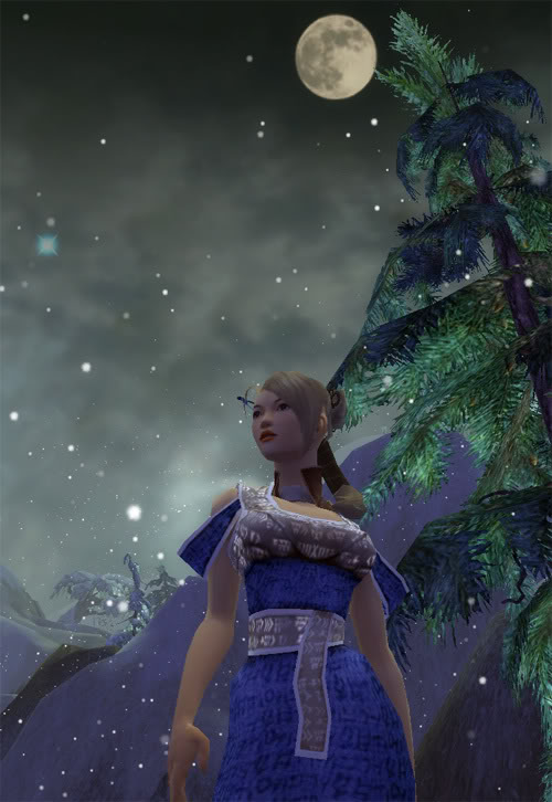 Full pic Here's a 'good luck' banner. I really liked it, not exactly modeling stuff but aside from the black block and text there has been no photoediting involved and I really liked the lightning that makes the models face look re-textured and sun-tanned(Great spot that I found somewhere...): *now I runs to study for my exam* Last edited by Nian; Apr 25, 2007 at 07:34 AM // 07:34.. |
|
|
|
Apr 25, 2007, 07:41 PM // 19:41
|
#4 |
|
Frost Gate Guardian
Join Date: Nov 2006
Profession: D/A
|
I love your december picture. It captured that cold, dark, quiet feeling I remember from growing up in Maine *perfectly(, along with a lively composition and good pose. I'm not sure if others would say the face needs to have more light on it (rather than the shoulder/chest), but tbh I felt that it helped make the mood to have her shadowy. My only "issue" is one that I had with my own first picture...the cropping of the fingers. Hands, imho, are almost as important as faces, and if they are in a picture at all, we should see them fully. Not easy to avoid that, though, with the way the GW camera works. :/
|
|
|
|
Apr 25, 2007, 10:19 PM // 22:19
|
#5 |
|
Wilds Pathfinder
Join Date: Jul 2006
Profession: E/
|
Foxeye I like your first pic better than your second. I like how your body is slightly turned and I liked how you chose the scenery. It looks like a different location not too bland but not too abstract that you turn to that instead of your model. It isn't prefect but it is still very nice.
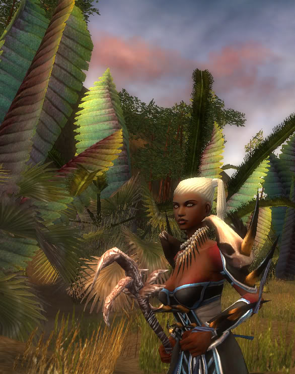
Nian I like your second picture better. Though you can't see anything in the background the shadow on your face and the armor your wearing looks good together. I do not like your first one though. It doesn't looking like your posing and the scenery looks very bland. It isn't terrible but I don't think it is your best. My Necro. Nice December day, at Beacons Perch, where there is always a light snow. My Ranger. Waking up in the morning in the springtime as the light pours in. I don't know why but I like this shot. Sort of like a different expression on her face. Last edited by Brandon1107; Apr 26, 2007 at 02:28 AM // 02:28.. |
|
|
|
Apr 26, 2007, 05:32 AM // 05:32
|
#6 |
|
Site Contributor
Join Date: Oct 2006
Location: Finland
Guild: Runners of the Rose [RR]
Profession: R/
|
Foxeye, I really like the second pic of the two. Her pose is very interesting, and it's nice to see how she is a part of the background rather than just "on top". It creates a really summery feeling. Energetic poses with movement tend to look a lot better than ones where the character just stands still, although energetic is also harder to pull off.
You've succeeded in getting something nice that's the best of both worlds. Nian, I love that pic of your monk! It catches the cold, snowy winter months so well! The shadowing on her face caught my eye too, but I think it creates a nice mood to it. The setting is just perfect. Oh, and I agree that the hands should be represented in the pic, they give a lot of feeling to an image too. Still, what can you do if the screen cuts them off... Brandon, I very much like the screen of your necro. Still, you should maybe have tried placing her a little less in the corner, and more towards the center? Somewhere halfway between the center and the corner would have been ideal. Now she just pulls the viewer's attention to one side, and all the lovely background feels like it's wasted. Generally it's a good idea to never have characters right in the middle of an image, or right in the far side, but instead try to have them just a little off from the center without running too much into the corner. Like Nian showed in the TNTM thread, the golden ratio works the best and it should always be kept in mind when taking shots. Your ranger shots are quite good too, but you seem to have a hard time with the lighting. I had this same problem when competing in TNTM - my ranger's skin is quite dark, so even if I found the perfect scenery for shooting I couldn't use it if the light was too dark. Same goes for you. In these two pics, there's a nice mood to them, but her face is way overshadowed because the light comes from behind her or too much from the side. I know it's a bother to think about lightsources, and how many good spots are totally spoiled because of it, but it is really important to get it right especially if your model is dark-skinned. She becomes difficult to look at if her face is too much in shadow or if the shadows are too strong. Dark-skinned characters are harder to take screens of because you have to pay even more attention to lighting than with fairer skinned characters, but once you learn to do it well, they look absolutely fabulous.
|
|
|
|
Apr 26, 2007, 07:26 AM // 07:26
|
#7 |
|
Lion's Arch Merchant
Join Date: Aug 2005
Location: Finland
Guild: I Need Scissors [Aivo]
Profession: Rt/
|
Brandon1107, about your Necro pic, with a composition like that it looks like the ugly grey mound in the background is the main point of the pic, and your Necro is just there posing in a "vacation photograph" way. And honestly, when picking a background, it's important that the bg isn't too distracting (like in your Ranger pics) but also that it's not too bland, which is the case in your first pic. There are tons of beautiful sceneries in GW, but also some that just look like really poor 3D modeling.
Foxeye, I love your pics <3. The composition and lighting are flawless. Very good shots. Nian, you rock xD. |
|
|
|
Apr 26, 2007, 04:10 PM // 16:10
|
#8 |
|
Frost Gate Guardian
Join Date: Nov 2006
Profession: D/A
|
Thank you for all the feedback! I didn't expect to get so much, nor that I'd hear such nice things. This is really fun. None of my characters have enough armor sets to be a true contestant, but I hope I can follow along on a few more assignments.
One thought for your necro picture, Brandon....because the gray/black part of her bikini top is the same color as the mountains behind her, it appears as if the red portion is the entire bra. Which gives her *ahem* granny boobs. Not so flattering.  Gotta be careful of details like that. Gotta be careful of details like that.The lighting on the face of the ranger in the first shot is actually very fascinating. I love it when lighting from the side sculpts the planes of the face so well. If you cropped it a little closer, so that it was just her head/shoulders/chest, it would make a wonderful beauty shot. It's a shame the lighting isn't a little brighter overall. |
|
|
|
Apr 26, 2007, 05:37 PM // 17:37
|
#9 |
|
Wilds Pathfinder
Join Date: Dec 2005
Guild: Shyft Machine [MYTH]
Profession: E/
|
I guess I will repost mine here too. I look forward to seeing all of the pictures posted here and in the contest. I love what I have seen so far.
Foxeye your second picture reminds me of a scene from that James Bond movie where the bikini clad woman walks out of the ocean.  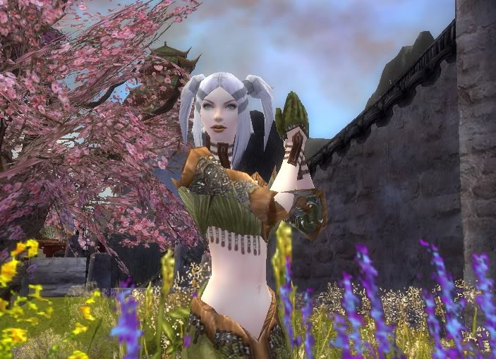
|
|
|
|
Apr 26, 2007, 07:42 PM // 19:42
|
#10 |
|
Wilds Pathfinder
Join Date: Jul 2006
Profession: E/
|
thank you guys...lol granny boobs i just noticed that. I don't think it is a "vacation photograph." I doubt anyone poses like that for any old pic. I don't really no why i cropped her on the side like that. eh i must of thought it looked cool at the time. I still do like the scenery though. I think it matches he skin tone and armor well (except for the granny boobs, hehe.)
also, what you said about the lighting, it is very tough finding a great background with great lighting as well, especially for the darked skin models. I have to work on lighting. I like working with my ranger more because she looks more like a model and I know all her emotes. But then again, i can learn my necros emotes. also Tommarrow watch for armor clipping, though it is a minor detail it looks very funny. I think the scenery is very nice and your armor ties in with it. The lighting is pretty much perfect because you have a light skinned character. just another thing you want a "balance" between you and your scenery so some pictures you can put your model smack-dab in the middle like this shot but sometimes you want them to be slightly to the side. all in all, I know I can do better so I will...be back soon. |
|
|
|
Apr 26, 2007, 08:28 PM // 20:28
|
#11 |
|
Frost Gate Guardian
Join Date: Nov 2006
Profession: D/A
|
Tommarrow: There's a lot in your picture that works well, especially at conveying the month of April (flowers, lighting, clothing, the fragile looks of the model), but the pose misses the mark for me because she is so straight, almost rigid. That would work for some moods/subjects, but not for a month where things are opening up and going giddy with new life.
Something to mull over, a quote from wikipedia in regards to the line of beauty theory: "According to this theory, S-Shaped curved lines signify liveliness and activity and excite the attention of the viewer as contrasted with straight lines, parallel lines, or right-angled intersecting lines which signify stasis, death, or inanimate objects." |
|
|
|
Apr 27, 2007, 12:23 AM // 00:23
|
#12 |
|
Academy Page
Join Date: Dec 2005
Location: Middle Of No Where
Guild: (GODS)
Profession: Me/
|
Nyra Sloan
I made a brand new derv tonight, so I decided to take some screens... I kinda copied Foxeye with the lacking of a skirt thing, but it not only clipped but i felt it was ditracting
anyways here they are! --------- |
|
|
|
Apr 27, 2007, 02:23 AM // 02:23
|
#13 |
|
Wilds Pathfinder
Join Date: May 2006
Guild: The Agonized
Profession: Rt/Mo
|
I see some references to Katina's leaf-model shot. They're nice!! I enjoy the lighting contrast, but the face may just be a little too dark.
Noanoa has skillz, post some screens! |
|
|
|
Apr 27, 2007, 04:39 AM // 04:39
|
#14 |
|
Site Contributor
Join Date: Oct 2006
Location: Finland
Guild: Runners of the Rose [RR]
Profession: R/
|
tommarrow: Very nice, there's definitely the right mood for the month. Although like Foxeye pointed out, I think her pose is too stiff for what it was intended... right now she just looks kind of awkward in the middle of all those flowers.
Also, the background is maybe a bit too busy and full of distracting things. I think a different way of cropping it might have worked better, or if you'd tried to find a slightly simpler background with flowers. Your model is still visible in this image, but she doesn't stand out as much as she could. A crowded background is another thing I had trouble with during the contest, so I learned to be careful with it.  white wolfgang, uuu, pretty dervish. She has the same hairstyle as mine. I like the lower picture, it gives an interesting feel of peeping in on her. The leaves could maybe be positioned a little more towards an upper corner, so they aren't as strong over the entire image, but otherwise that's a very nifty idea! I like it. The upper image is good too, although there I think she is a bit too much to the side again. The background takes too much attention away from her. |
|
|
|
Apr 27, 2007, 06:00 AM // 06:00
|
#15 |
|
Wilds Pathfinder
Join Date: May 2006
Guild: The Agonized
Profession: Rt/Mo
|
I looked through my new necro's portfolio and found 3 that fit this theme's assignment! Some might have been posted before, the other one was just a thing I did in celebration of my newly bought 15k Luxon armor.
 Spring! 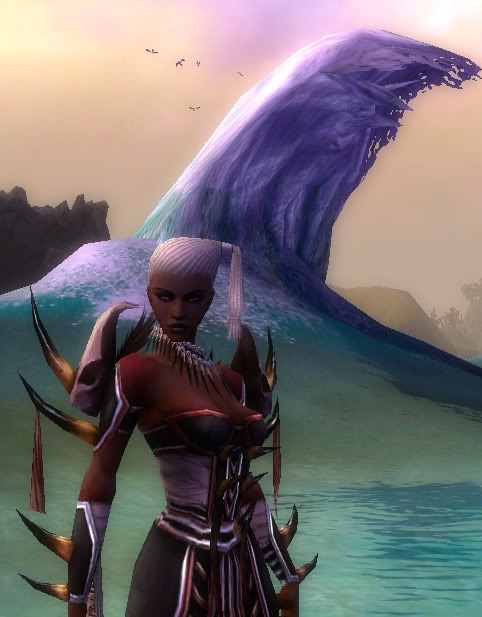 Summer! (The first thing that came to my head with summer was beach, and where else but luxon territory will you find the prettiest beaches?) I know the face is dark, but I love how it contrasts against the rather joyful background. 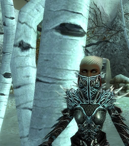 Winter (this one is BAD, but it was relevant to this week's assignment, hehe) I <3 this hair + face combo, but it might just be me. |
|
|
|
Apr 27, 2007, 09:12 AM // 09:12
|
#16 |
|
Lion's Arch Merchant
Join Date: Aug 2005
Location: Finland
Guild: I Need Scissors [Aivo]
Profession: Rt/
|
At first I went for a Wintersday (Grenth vs Dwayna photoshoot -- Nian's HAWT dervish was my Grenth, and her Melonni was Dwayna), and I think the colours in the pics I got are absolutely stunning, but in the end I didn't pick any of them for the official assignment because I felt a bit too insecure about having too many characters in one shot. 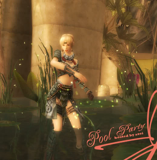 This is something I made a week ago or so, it's obviously 'shopped but I didn't touch the original screenshot much. I wish I'd gotten July or August, I've got tons of these pics and they're all so wonderful. |
|
|
|
Apr 27, 2007, 10:56 AM // 10:56
|
#17 |
|
Krytan Explorer
Join Date: Nov 2006
Profession: D/
|
I had gotten July. But I really wanted to try something Unique. I'm not quite sure if I pulled it off. only time will tell i suppose! I wanted November or a similar month, I love dramatic Lighting and dim areas. Makes me feel like the main presence in the pic or something. I dont know why, hard to describe! I love your shots Noanoa! especially the one with Dwayna eyeing up your hair ^^
And I love your necro! Makes me want to play mine, although admittedly I've lost the spark for that profession =P Heres a photo of Mila that i had taken whilst playing about with undies ad in cycle one: 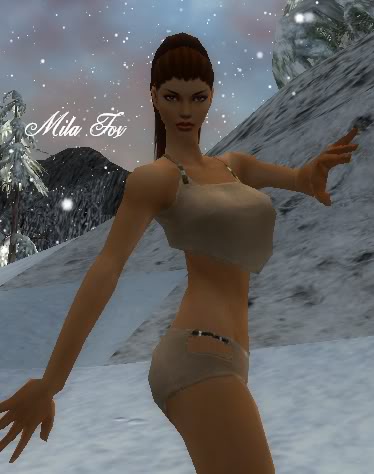 Also whilst routing through my screenie folder, i found this: 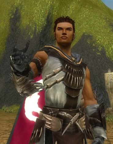 Mila makes a hot bloke ^^ |
|
|
|
Apr 27, 2007, 02:15 PM // 14:15
|
#18 |
|
Lion's Arch Merchant
Join Date: Jan 2007
Location: Belgium, Europe
Guild: Grenth's Rejects [GR]
Profession: N/Me
|
The first one is one of the pics that didn't get selected for Twelve, and the second one... After I pushed the screen shot button at the wrong moment for the umpteenth time, Sihaya got a little desperate xD
|
|
|
|
Apr 27, 2007, 03:52 PM // 15:52
|
#19 |
|
Lion's Arch Merchant
Join Date: Aug 2005
Location: Finland
Guild: I Need Scissors [Aivo]
Profession: Rt/
|
I love it how you all use so much background in your shots. I browsed through Cycle 1 yesterday (and saved all the pics onto my hd xD) and I noted that most of the assignment shots were cropped really close to the character. The pic I submitted yesterday for the assignment had much more background space, but after looking at all those Cycle 1 pictures I went and cropped it closer to my character. Now I feel I should have kept all that beautiful bg ;_;.
Sihaya, that November shot is really pretty! The dark flowers around her are a nice detail. It's a shame the tree textures look so bad at close range ;_;. Also, your character takes very little space in the picture, which is also a pity since, imho, we should be always mindful of looking like models and being the point of interest. Keep the pictures coming! (I'm at my old folks' place and can't play much, so I need some entertainment *hits F5 repeatedly*) |
|
|
|
Apr 27, 2007, 04:09 PM // 16:09
|
#20 |
|
Lion's Arch Merchant
Join Date: Jan 2007
Location: Belgium, Europe
Guild: Grenth's Rejects [GR]
Profession: N/Me
|
Noa, those are the reasons why I didn't pick it ^_^ Thanks for the feedback!
|
|
|
 |
|

«
Previous Thread
|
Next Thread
»
| Thread Tools | |
| Display Modes | |


 Linear Mode

|
|

All times are GMT. The time now is 03:23 AM // 03:23.
