 |
|
|
|||||||


 |
|
|
Thread Tools | Display Modes |
 Feb 23, 2015, 12:30 AM // 00:30
|
#1 |
|
Pre-Searing Cadet
Join Date: Oct 2008
Location: Ojai, California
Profession: Mo/Rt
|
 Introducing Minimalus UI: A hyper minimal, feature-rich texmod interface!
I have been playing Guild Wars off and on for the better part of a decade now, and I've always been bothered by the HEAVY, DISTRACTING bloat of the default interface. I recently migrated to a tiny (11.6") laptop, and the bloated interface greatly detracted from my ability to enjoy Guild Wars because the entire game was masked behind layers of white and beige interface grime!!! So I decided to do something about it.
 -- Introducing Minimalus UI: the cleanest, slimmest, most feature-rich interface ever made for GW!! Brief overview:
Click for full resolution! Notice the gorgeous, high-fidelity lines! 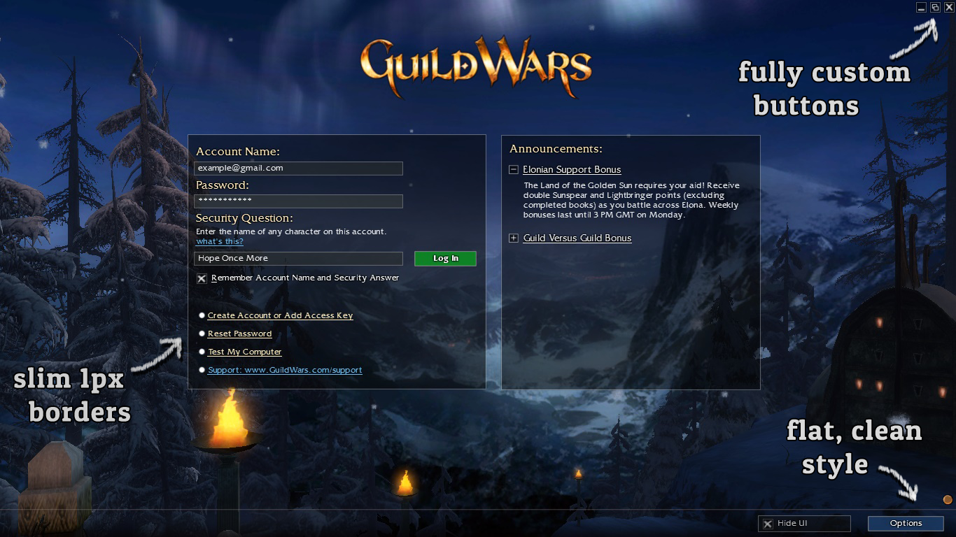 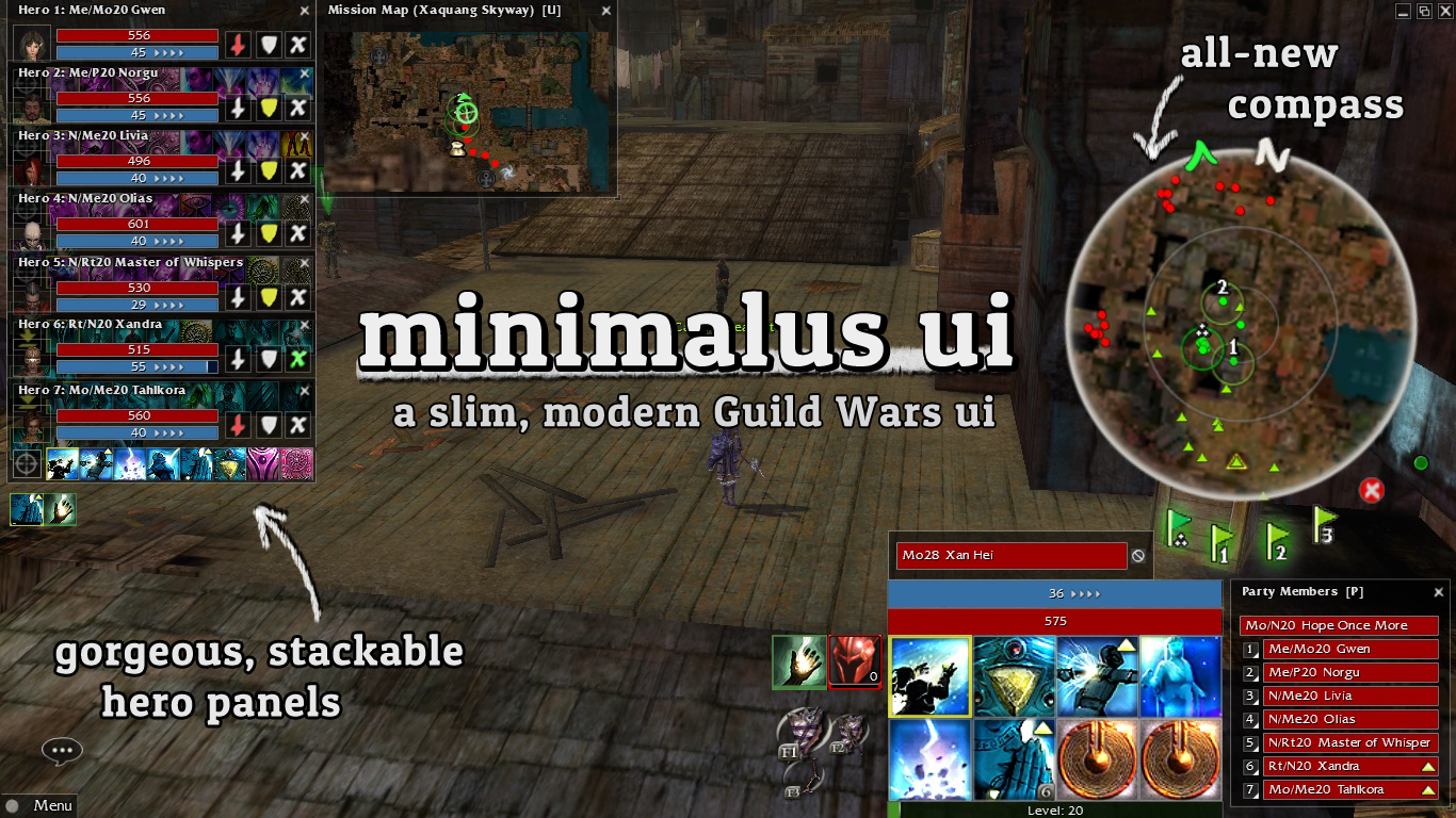 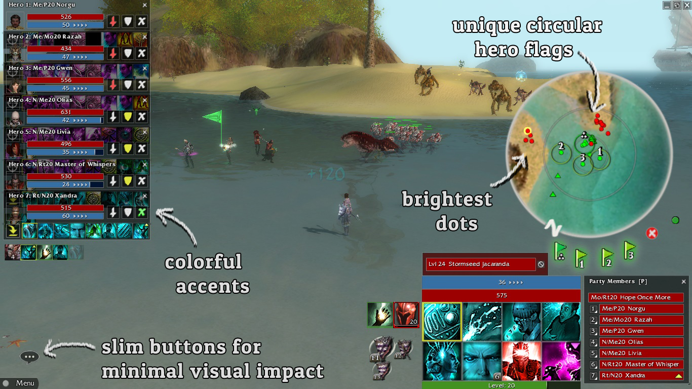 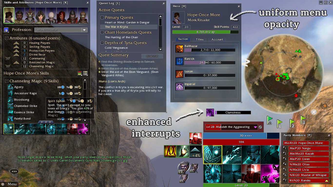 -- Compass featurette:
 -- Stackable Hero Panels Featurette:
 -- Here are some before/after GIFs.
-- If you like what you're seeing, check out the download link at the full release thread right here.  I'm still tweaking this thing and updating every few weeks, so let me know if you notice anything broken or want anything extra!! Comment below and let me know what you think! Last edited by Naiobwyn; Feb 23, 2015 at 07:51 AM // 07:51.. Reason: Typos & minor omission |

|

|
|
Feb 23, 2015, 12:54 AM // 00:54
|
#2 |
|
Administrator
Join Date: Jun 2006
|
The transparent hero panels are a great idea. Not sure if it'll make it clear enough to make me happy to stack them though, especially given the hero names and stuff is still there. I'd give it a trial run to see how it goes in practice but I'm not going to run TexMod until the whole ban drama gets sorted properly (i.e, we get a response on whether it's ok).
Other than that, it doesn't really suit my aesthetic but the practical aspect definitely comes through.
__________________

|
|
|
|
|
Feb 26, 2015, 01:04 AM // 01:04
|
#3 |
|
Desert Nomad
Join Date: Aug 2008
Location: Dallas, Texas
Guild: Zero Quality [zQ] /[LaG]/[USA]/[iQ]
Profession: A/E
|
I really like everything about it. Its very sleek and I actually might end up using it when I play.
One request I'd like is that the color of the mana/hp bars stay the original. I like the no borders but the flat colors on those bars are the thing throwing me off when I look at it. |
|
|
|
|
Feb 26, 2015, 07:35 PM // 19:35
|
#4 |
|
Pre-Searing Cadet
Join Date: Oct 2008
Location: Ojai, California
Profession: Mo/Rt
|
Link to download Minimalus UI v1.9 (Classic Bars Edit).tpf at Dropbox.
|
|
|
|
|
Apr 03, 2015, 01:42 PM // 13:42
|
#5 |
|
Academy Page
Join Date: Jan 2015
Profession: Mo/
|
I find Dark Glass UI to be better.
Last edited by Marty Silverblade; Apr 03, 2015 at 10:09 PM // 22:09.. |
|
|
|
|
Apr 25, 2015, 07:04 AM // 07:04
|
#6 |
|
Pre-Searing Cadet
Join Date: Oct 2008
Location: Ojai, California
Profession: Mo/Rt
|
why would you come to this project that I worked so hard on and say something like that?
|
|
|
|
|
Apr 25, 2015, 08:30 PM // 20:30
|
#7 | |
|
Frost Gate Guardian
Join Date: Jul 2011
Location: California
Guild: The Royal Dragon Riders [TRDR]
Profession: D/A
|
Quote:
Im sure he got banned for a good reason though lol. Ive been using this mod quite a bit, I like it! Only things I might change would be the compass border as it kinda feels out of place with the rest of the UI. And also, maybe modify the skill casting/recharge animations to be a little bit more noticeable (thinking of dromod when I say that), might flair it up a bit .Overall though, it works really well and has no alignment issues that i can see that are big in other UI mods xD so thank you for that. |
|
|
|
|

|
Jul 06, 2015, 08:38 AM // 08:38
|
#8 |
|
Pre-Searing Cadet
Join Date: May 2015
|
Transparent text boxes are a great idea. Everything looks neater overall. Nice work.
|
|
|
|
|
Apr 17, 2016, 04:19 AM // 04:19
|
#9 |
|
Ascalonian Squire
Join Date: Jun 2011
Profession: Rt/
|
Just want to say that this is still the best UI mod I've found. Thanks!
|
|
|
|
|
|

«
Previous Thread
|
Next Thread
»
| Thread Tools | |
| Display Modes | |


 Linear Mode

|
|

All times are GMT. The time now is 12:43 PM // 12:43.
